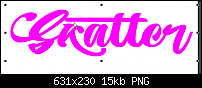
This is how Illy displays the glyphs (pictured). The two different t glyphs need to be selected from the glyph panel,
but the arrangement I have shown doesn't seem to appear anywhere else.


 Member
This is how Illy displays the glyphs (pictured). The two different t glyphs need to be selected from the glyph panel,
but the arrangement I have shown doesn't seem to appear anywhere else.
** Detailed "Create A Spinning Logo Tutorial" is available in .pdf format for download at this link **
Outside of a dog, a book is a man's best friend. Inside of a dog, it's too dark to read. Groucho Marx.
Member
The ugly tt ligature does appear unbidden from time to time.
For 8 bucks, I'm not bothered by it.
** Detailed "Create A Spinning Logo Tutorial" is available in .pdf format for download at this link **
Outside of a dog, a book is a man's best friend. Inside of a dog, it's too dark to read. Groucho Marx.
 Member
Ah, you were composing that tt combination using the glyph panel. I read your post as it were an automatic substitution.
Yep, without a glyph browser, one needs to use another utility.
 Posting Permissions


 Reply With Quote
Bookmarks