Given the ubiquitous and often inappropriate use of Lobster, could it now have replaced Comic Sans as the Number One poorly used font?
Discus...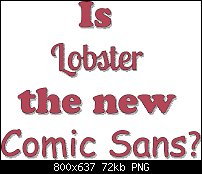


 Member
Given the ubiquitous and often inappropriate use of Lobster, could it now have replaced Comic Sans as the Number One poorly used font?
Discus...
** Detailed "Create A Spinning Logo Tutorial" is available in .pdf format for download at this link **
Outside of a dog, a book is a man's best friend. Inside of a dog, it's too dark to read. Groucho Marx.
 Member
It is ubiquitous, maybe even pervasive. But being newer than CS, I don't think Lobster has obtained the full impact of seeing CS.
For myself, I still like the shape Lobster presents and I cannot quite say the same thing about CS. Maybe because I never liked CS to begin with. I also see what I consider the misuse of various styles of type in situ. Mainly in advertising and somewhat in magazine situations, rarely in books but even there I have seen goofy fonts used for chap starts.
Member
Lobster is fine by me, Lobster Two less so. The upright version looks quite ungainly to me. I suppose that being a free font readily available from Google is the cause of the ubiquity. And the font isn't at fault for the bad choices that some people make using it. You are right, of course, that Comic Sans has held centre stage for a long time now and the misuses are more glaringly obvious (to some).
** Detailed "Create A Spinning Logo Tutorial" is available in .pdf format for download at this link **
Outside of a dog, a book is a man's best friend. Inside of a dog, it's too dark to read. Groucho Marx.
 Member
Funnily enough I've not used 'Lobster' (yet!) but had noticed it's growing popularity.
Before I knew about the vehement dislike (by the design world) for Comic Sans I regularly used it for all sorts of printed and screen based materials without any complaint or worry. I had always felt uncomfortable with the look of it, but because it was everywhere (like Helvetica) and was under the impression it was dyslexic friendly (see link below), I thought it was an ok font to use.
I obviously I don't use it now, although I have warmed a little to 'the new Comic sans', Comic Neue for quick annotations etc (see silly example below!).
Here's an article about Comic Sans from a educational use perspective:
https://www.tes.com/news/long-read-w...ic-sans-anyway
And here's a Wikipedia link about Comic Neue:
https://en.m.wikipedia.org/wiki/Comic_Neue

Jon (Jono) Xara Photo & Graphic Designer 19.0.0.64329 DL x64 May 19 2022
 Moderator Posthumous
Actually I like the 1.4 version. Haven't used it but still I like it. So what does that say about me?, because I also like Comic Sans but haven't used that either.
Larry a.k.a wizard509
Never give up. You will never fail, but you may find a lot of ways that don't work.
 Member
I actually designed my web logo using Comic Sans, and to be honest have no problems with the font depending where it's used. It was done in Microsoft Image Composer ... God, that's going back a long time.

Keith
~~~~~~~~~~~~~~~~~~~~~~~~~~~~~~~~~~~~~~~
There are 10 types of people in this world .... Those who understand binary, and those who don't.
Member
To be honest, Larry I don't think personal taste matters, one either likes something or one does not.
The fact that you haven't used Lobster probably means that you haven't come across an occasion where it would be suitable for use.
That just shows good judgment on your part.
There are many situations where neither of the fonts, Comic Sans and Lobster are suitable, but either might easily fit the bill in an upcoming project.
** Detailed "Create A Spinning Logo Tutorial" is available in .pdf format for download at this link **
Outside of a dog, a book is a man's best friend. Inside of a dog, it's too dark to read. Groucho Marx.
 Posting Permissions


 Reply With Quote
Bookmarks