Welcome to TalkGraphics.com
Results 1 to 9 of 9
  1. #1
    Join Date
    May 2002
    Location
    Canada
    Posts
    3,339

    Default Big mobile issue

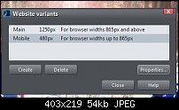
    I am making my mobile variant. See pic attached. I do not want ipad to show my mobile variant that is set for 480 res.
    I want the ipad to access only the desktop version of 1250.

    How can I change this? I am already into half of the website.

    Need your help please.

    Click image for larger version. 

Name:	Clipboard-1.jpg 
Views:	105 
Size:	54.4 KB 
ID:	119498
    Last edited by behzad; 13 December 2017 at 04:36 PM.

  2. #2
    Join Date
    May 2002
    Location
    Canada
    Posts
    3,339

    Default Re: Big mobile issue

    This is how it looks on an ipad or any other tablet. I do not want this mobile version, I want the desktop version.
    Attached Thumbnails Attached Thumbnails Click image for larger version. 

Name:	Clipboard-1.jpg 
Views:	78 
Size:	95.6 KB 
ID:	119499  

  3. #3
    Join Date
    Mar 2009
    Posts
    4,503

    Default Re: Big mobile issue

    You could lower the Page width value (under Properties) and that will automatically lower the browser width.

  4. #4
    Join Date
    May 2002
    Location
    Canada
    Posts
    3,339

    Default Re: Big mobile issue

    This did not help. The only way is to make a mid size variant too. or do everything 640 instead of 480.

  5. #5
    Join Date
    May 2002
    Location
    Canada
    Posts
    3,339

    Default Re: Big mobile issue

    I do not want to have 3 variants, can I avoid this problem by only keeping 2 variants?

  6. #6
    Join Date
    Mar 2009
    Posts
    4,503

    Default Re: Big mobile issue

    It doesn't have any effect? Have you tried a template to check if it has the same issue?

  7. #7
    Join Date
    Sep 2011
    Location
    Darlington, Western Australia
    Posts
    239

    Default Re: Big mobile issue

    Hi Behzad. The way to fix this issue is to change your variant to 400px. I make all mobile variants this size and they display perfectly. I call the variant : Smartphon 400px
    It will display on a tablet the same way it does on a laptop or desktop, and will display correctly on any phone also. As you have already made the variant 480px, you will need to resize your page elements to fit the amended 400px width.
    Live your life in such a way that when your feet hit the floor in the morning, Satan shudders and says, 'Oh s$%#t....she's awake!'

  8. #8
    Join Date
    May 2002
    Location
    Canada
    Posts
    3,339

    Default Re: Big mobile issue

    Thank you so much, will try that. Oh if it works your an angel

  9. #9
    Join Date
    May 2002
    Location
    Canada
    Posts
    3,339

    Default Re: Big mobile issue

    Thank you, it was helpful, however the culprit was the 1250 desktop main size. I lowered that and kept the 480px for mobile. I had to get the lowest tablet res. to go to the main site. Learning curve


Bookmarks

Posting Permissions

  • You may not post new threads
  • You may not post replies
  • You may not post attachments
  • You may not edit your posts
  •