


 Varient is giving me a headache
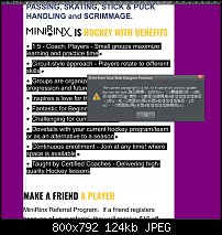
So I am trying to make my clients mobile version with the variant option and working with styles. So the latest error is this when
I wanted to update the style only on this mobile variant. How did oriental language get in here? I am really tempted to
just make a separate mobile site.

 Reply With Quote


Bookmarks