Hi, all!
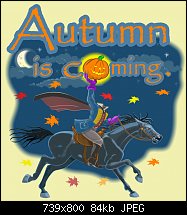
I just finished creating this Autumn/Halloween t-shirt and poster design. I'd love your feedback on it. Thanks!


 Member
Hi, all!
I just finished creating this Autumn/Halloween t-shirt and poster design. I'd love your feedback on it. Thanks!
 Member
It's a lovely image with many wonderful elements. The only thing is that my eyes don't find a focal point in the design. I find the brightly colored elements, such as the glow, the leaves and the gloves a bit distracting. Perhaps the lettering could be a bit more separate from the actual drawing.
Member
I've sold a few tees with this image, so I guess I'm happy with it. Thank you for your commentary, Boy.
 Member
For myself, I first see the pumpkin, then my eyes rationalize that the pumpkin stands in for the O in the word Coming. My eyes then travel down the arm to the headless horseman. I don't see the same focal issue.
I too would use some other colors and treatments . But I can chalk that up to different designers and my clients and/or target markets.
 Moderator Emeritus
Great image. No problems here.
Gary W. Priester
Mr. Moderator Emeritus Dude, Sir
gwpriester.com | eyetricks-3d-stereograms.com | eyeTricks on Facebook | eyeTricks on YouTube | eyeTricks on Instagram
 Member
The headless horseman, love it toonicorn.
Member
Thanks for the input, everyone! Much appreciated!
 Posting Permissions

 Reply With Quote
Bookmarks