Assignment LOGO #10
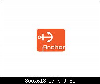
This company (Anchor) wanted a logo that did NOT include the color blue, which, I must admit is a wiser branding device. So, I set about making said logo. This is one of those logos, that, for me, no matter what I sketch it will not be the final image. I start out with one idea and then wind up going in another direction entirely. This logo was fun to make even though I spent forever and a day getting everything "just so". Anchor is a clothing store that specializes in nautical style clothing and many of their outfits are actually cut from real sail materials.
Impressions? I REALLY like this image. I love the text bleeding off the background square. And I love the reverse type, giving it some contrast. Con? I wish I could have found the rotate tool sooner, took me a while to get the anchor the way I wanted it. Incidentally, the anchor, I chose, from several that were on pixabay. Many looked angry instead of friendly but I did manage to find a friendly anchor but I had to add an upper cross bar to it so that it would look more like a classical anchor.
I had a devil of a time trying to print this image out. My printer has gone loopey and won't print. maybe it'll behave later today and let me print my logo.
So, how'd I do? Is this image satisfactory to you? Did I make the grade?
Mark


 Reply With Quote


 Acorn - installed Xara software: Cloud+/Pro+ and most others back through time (to CC's Artworks). Contact for technical remediation/consultancy for your web designs.
Bookmarks