Welcome to TalkGraphics.com
Page 18 of 20 FirstFirst ... 81617181920 LastLast
Results 171 to 180 of 199
  1. #171
    Join Date
    Apr 2015
    Location
    Colorado USA
    Posts
    710

    Default Re: Mark321's THIRTY LOGOS assignments

    Assignment LOGO #28

    Click image for larger version. 

Name:	Fashionista.jpg 
Views:	75 
Size:	26.7 KB 
ID:	118274 Click image for larger version. 

Name:	Fashionista Mockup.jpg 
Views:	60 
Size:	48.4 KB 
ID:	118275

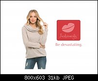
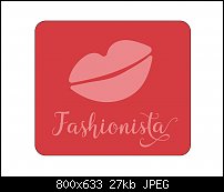
    Fashionista is an app that lets you use your smart phone to take a picture of your clothes and then the app will find accessories at local shops to go with your wardrobe. Clever app indeed. They wanted a logo whose icon would work on an app all by itself. This one was fun and easy to make. And I used the acronym: KISS (keep it simple stupid). The lip image was originally an image from Filter Forge but unfortunately it was too detailed. So, to keep it simple, I traced the outline of it. The colors were chosen for their high fashion look that was also easy on the eyes. The client wanted two color only logo.

    Impressions? Sexy as hell, especially the mockup. Love the expression and body language. Cons? Maybe the font was a little too swashy. Should I leave it as is or lose some of the glyphs?

    Mark

    P.S...Thanks for the kind words, Bob.
    P.S.S...I re-did the mockup. It was off center.

    Click image for larger version. 

Name:	Fashionista Mockup.jpg 
Views:	93 
Size:	31.5 KB 
ID:	118276

  2. #172
    Join Date
    Mar 2007
    Location
    ...Granada province, Andalucia, Spain
    Posts
    5,302

    Default Re: Mark321's THIRTY LOGOS assignments

    The lips don't look so good, I'm afraid, if they were bright red and shiny, they would look like the fake lips that used to come in Lucky Bags (showing my age there).
    Perhaps the colours are wrong, Mark. Why not go for something a little outlandish, purple lips, perhaps on a lilac background.* But I'm only guessing.
    I don't really feel qualified in any way to assist with this. I know this is 2017, but an app to find accessories for your clothes sounds plain daft to me.
    The world is definitely going mad.

    * Perhaps the lips should be more pursed. From what I've seen, all young women these days are pursing their lips all the time.
    Bob.
    ** Detailed "Create A Spinning Logo Tutorial" is available in .pdf format for download at this link **
    Outside of a dog, a book is a man's best friend. Inside of a dog, it's too dark to read. Groucho Marx.

  3. #173
    Join Date
    Apr 2015
    Location
    Colorado USA
    Posts
    710

    Default Re: Mark321's THIRTY LOGOS assignments

    Quote Originally Posted by iamtheblues View Post
    The lips don't look so good, I'm afraid, if they were bright red and shiny, they would look like the fake lips that used to come in Lucky Bags (showing my age there).
    Perhaps the colours are wrong, Mark. Why not go for something a little outlandish, purple lips, perhaps on a lilac background.* But I'm only guessing.
    I don't really feel qualified in any way to assist with this. I know this is 2017, but an app to find accessories for your clothes sounds plain daft to me.
    The world is definitely going mad.

    * Perhaps the lips should be more pursed. From what I've seen, all young women these days are pursing their lips all the time.
    Bob.
    Bob! You and me both are probably getting up there in age. I will try some other colors later, gotta go to town for a little while. And yes, young women are pursing their lips a lot these days. I think they think it's attractive. Who knows what young people think these days. The world is going mad, yes. LOL!

    Mark

  4. #174
    Join Date
    Apr 2015
    Location
    Colorado USA
    Posts
    710

    Default Re: Mark321's THIRTY LOGOS assignments

    I'm baaaaack...

    I chose a new color scheme. This one's called Cherry Cheesecake. Gotta love it! And I gave the lips more pucker.

    Click image for larger version. 

Name:	Fashionista.jpg 
Views:	77 
Size:	26.1 KB 
ID:	118293 Click image for larger version. 

Name:	Fashionista Mockup.jpg 
Views:	78 
Size:	32.6 KB 
ID:	118294

    Mark

  5. #175
    Join Date
    Apr 2015
    Location
    Colorado USA
    Posts
    710

    Default Re: Mark321's THIRTY LOGOS assignments

    Assignment LOGO #28.5

    This isn't an actual assignment and therefore doesn't count but I thought I'd share it with you anyway. It's my logo before and after my lessons. Can you see a difference?!

    Click image for larger version. 

Name:	My Personal Logo (new and old).jpg 
Views:	82 
Size:	29.6 KB 
ID:	118296

    The old one is on the left (in case you didn't know)

    Enjoy!

  6. #176
    Join Date
    Apr 2015
    Location
    Colorado USA
    Posts
    710

    Default Re: Mark321's THIRTY LOGOS assignments

    Someone said the bottom text in the new logo was too thin. So, how about now?! Personally, I like the thinner weight font, but that's just my opinion here.

    Click image for larger version. 

Name:	My Personal Logo (new and old).jpg 
Views:	78 
Size:	31.7 KB 
ID:	118298

    And for those who want to know, I'm using Montserrat (black and regular weights).

  7. #177
    Join Date
    Apr 2015
    Location
    Colorado USA
    Posts
    710

    Default Re: Mark321's THIRTY LOGOS assignments

    Quote Originally Posted by Mark321 View Post
    I'm baaaaack...

    I chose a new color scheme. This one's called Cherry Cheesecake. Gotta love it! And I gave the lips more pucker.

    Click image for larger version. 

Name:	Fashionista.jpg 
Views:	77 
Size:	26.1 KB 
ID:	118293 Click image for larger version. 

Name:	Fashionista Mockup.jpg 
Views:	78 
Size:	32.6 KB 
ID:	118294

    Mark
    That's supposed to be the exact SAME color in the tag line that's in the logo. But I swear to my eyes they do NOT look the same to me.

  8. #178
    Join Date
    Mar 2007
    Location
    ...Granada province, Andalucia, Spain
    Posts
    5,302

    Default Re: Mark321's THIRTY LOGOS assignments

    Quote Originally Posted by Mark321 View Post
    Someone said the bottom text in the new logo was too thin. So, how about now?! Personally, I like the thinner weight font, but that's just my opinion here.


    Click image for larger version. 

Name:	My Personal Logo (new and old).jpg 
Views:	78 
Size:	31.7 KB 
ID:	118298

    And for those who want to know, I'm using Montserrat (black and regular weights).
    Well, Mark, I'm sure you know the answer. Of course it's better!
    ** Detailed "Create A Spinning Logo Tutorial" is available in .pdf format for download at this link **
    Outside of a dog, a book is a man's best friend. Inside of a dog, it's too dark to read. Groucho Marx.

  9. #179
    Join Date
    Apr 2015
    Location
    Colorado USA
    Posts
    710

    Default Re: Mark321's THIRTY LOGOS assignments

    Quote Originally Posted by iamtheblues View Post
    Well, Mark, I'm sure you know the answer. Of course it's better!
    Thanks, Bob!

  10. #180
    Join Date
    Apr 2015
    Location
    Colorado USA
    Posts
    710

    Default Re: Mark321's THIRTY LOGOS assignments

    Assignment LOGO #29 (of 30)

    Click image for larger version. 

Name:	Film.jpg 
Views:	70 
Size:	16.5 KB 
ID:	118299 Click image for larger version. 

Name:	Film Mockup.jpg 
Views:	70 
Size:	40.3 KB 
ID:	118300

    Today's logo assignment is near and dear to my heart. I started studying motion picture photography when I was 9 years old. And I know a lot about this process. Surprisingly, I didn't stay in film only because I graduated into still photography by the time I was 16. Two days before I my 16th birthday, because of my love for photography, I landed my first job as the camera operator and floor director for the local evening newscast. I continued working in television for 8 years, working in production and in master control room. As for the logo, this client wanted a black and white logo with an icon that would be memorable. I designed the 35mm movie camera from memory not from a picture. The company is a non-profit that helps new, up-and-coming film talents.

    Impressions? I think the image speaks my language of love for movie making indeed. Cons? NONE!

    What do you think? Did I nail the look or not?

    Mark


Bookmarks

Posting Permissions

  • You may not post new threads
  • You may not post replies
  • You may not post attachments
  • You may not edit your posts
  •