I don't think that 3 different fonts is a good idea at all.
Also I can't see the point of having blue for the wrench and then a slightly different blue/green for the text beneath it.
Must try harder!


 Member
I don't think that 3 different fonts is a good idea at all.
Also I can't see the point of having blue for the wrench and then a slightly different blue/green for the text beneath it.
Must try harder!
** Detailed "Create A Spinning Logo Tutorial" is available in .pdf format for download at this link **
Outside of a dog, a book is a man's best friend. Inside of a dog, it's too dark to read. Groucho Marx.
 Member
I agree that 3 fonts is not great and I must admit I thought the ampersand wasn't as cool as the 3rd font. I will fix that. But there is only 2 colors in the logo, black and light blue (no third color, I promise). LOL!Originally Posted by iamtheblues


Member
Assignment LOGO #23
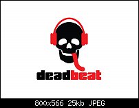
Deadbeat is an online music community focused on EDM, Drum & Bass, House, Dubstep, etc. type of music. I looked up their competitors, Monstercat and 99 Lives. Both competitors used a san serif font and a predominate color, black. So, I chose the perfect font: Breakaway and I used all lowercase letters to mimic Monstercat's logo. Plus, the first letter capitalized looked dull and not modern; so I went with all lowercase letters. The client wanted a skull to represent the "dead" part and a set of headphones to represent the "beat" part. I found the perfect skull but had to edit it. I threw in the tongue hanging out, which is red to match the red of the headphones.
Impressions? I'd love to see this logo on a website, kindda cool. I especially like the tongue (which took a while to make it look right). Cons? I don't know if red was a good idea for the second color. Would another color do better?
So, this is a beautiful logo that's clean and simple, yet stylish. Did I do good or did I do good!
Mark
Member
I beg to differ...unless Xara's colour editor has gone haywire.
** Detailed "Create A Spinning Logo Tutorial" is available in .pdf format for download at this link **
Outside of a dog, a book is a man's best friend. Inside of a dog, it's too dark to read. Groucho Marx.
Member
Bob, this is strange. I used Ai to set the colors of this logo. I just checked the hex code for the icon and the text and both say something different from what you got in your sampling.
I checked and the colors are exactly the same hex code (00AEEF) which, Ai has named "Cyan". Now, I'm confused.
Maybe Illustrator's color thingy has gone loopey. I just don't know.Even if I failed to switch the color mode back to RGB the colors would still be the same "wrong" color, right?
Well, hopefully my red and black logo (see above) has no color issues.
P.S...I tried to pick the part of the icon that I thought would be the most likely place you sampled the color from. If not let me know.
P.S.S...I put the image through Xara and typed in the exact same hexcode 00AEEF and Xara says it's not 100% Cyan. Now, I'm all confused here. I did originally create the image in CMYK mode but then when I made the jpeg to post online I converted the image to RGB. But wouldn't the colors still be the same "wrong" color if the original was the same color?
I'm getting a headache now.
Last edited by Mark321; 30 June 2017 at 04:13 PM.
 Member
That looks fantastic Mark! that would totally appeal to my son who is into that (rubbish) music!
Member
LOL! That's funny, sculptex! But I AM glad you like my logo.
Member
Nice and simple, well done!
Bob.
** Detailed "Create A Spinning Logo Tutorial" is available in .pdf format for download at this link **
Outside of a dog, a book is a man's best friend. Inside of a dog, it's too dark to read. Groucho Marx.
Member
Thanks, Bob!
Member
Assignment LOGO #24
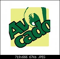
Avocado is an app that, when bought with the bundle package, will allow the user to not only track exactly how much the user is spending in the grocery store but also keep up with calories and other useful data. The client wanted a logo that had BOTH text and an icon of an avocado (how original). I stuck to 3 colors (I wanted two but it just wouldn't work out) and chose the font "Wendy One". I had to make the words AS BIG AS possible so I placed the text on an angle an made the text slightly larger than the image boundaries. And I placed the icon in place of the first "o" in avocado (original again, I know). But it DID work! The client wanted to see the image as a 60 x 60 pixel image too; so, I reduced it.
Impressions? This image was HARD to create. I had to somehow make the text as large as possible in a small space so I "overlapped" the letters and used a black stroke around the letters to keep them from becoming to difficult to read (I think it worked) Cons? Remind me to never make a logo for an app (in real life). LOL! This puppy was a tough nut to crack. I definitely did NOT enjoy this one. But for some strange reason whenever I have a hard time with a particular logo; you guys manage to not only help me but see it in a better light than me.
So, go ahead, tell me how bad this logo is. I probably broke every rule in the logo book to try and make this tiny logo work. Simplifying didn't work as I had planned because when it was simple it was too small to read the text. So, I did everything I could think of to make the letters large enough to read. But I don't think I will ever live this one down. I will probably always wish I knew what to do. In real life, if I can't do something, I don't. And I tell the client whether or not I'm able to deliver what they need. I'm an honest person. So sue me.
You'll have to forgive me if I sound like I'm ranting. I only slept 2 hours last night. But here's a smile on my face, just the same:
Mark
 Posting Permissions


 Reply With Quote

Bookmarks