Bob! You're RIGHT!Originally Posted by iamtheblues


 Member
Bob! You're RIGHT!
 Member
You posted before I uploaded my/your graphic, but it's good advice to try and limit your colours if at all possible to no more than four. (print costs)
The mock-up's cool, I like it.
Bob.
** Detailed "Create A Spinning Logo Tutorial" is available in .pdf format for download at this link **
Outside of a dog, a book is a man's best friend. Inside of a dog, it's too dark to read. Groucho Marx.
Member
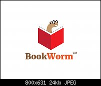
Thanks for the compliment, Bob. And the color limit is a good thing to keep in mind so I reduced the colors down to 3 colors. And the logo actually looks better with fewer colors, more simple and clean. I learn something new everyday.
Mark
Last edited by Mark321; 21 June 2017 at 09:50 PM.
Member
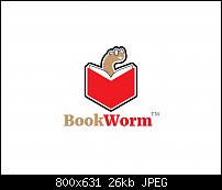
The black stroke surrounding the bookworm icon was too close to the image, making the worm's glasses hard to see. So, I moved the black stroke further away from the worm (double stroke, white/black).
Last time:

Member
I think we are done here.
Bob.
** Detailed "Create A Spinning Logo Tutorial" is available in .pdf format for download at this link **
Outside of a dog, a book is a man's best friend. Inside of a dog, it's too dark to read. Groucho Marx.
Member
Assignment LOGO #15 (Whew! Half way though!)
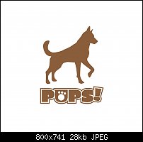
Today's logo is brought to you by the letter "p". As in "puppies"! Always adorable with an upbeat personality. I guess animals (puppies and kittens), along with babies, will always be able to tug at humanity's heart strings. This company is a delivery service for pets of every kind and especially dogs. They deliver medicine, food, treats and other pet supply goods. This online corporation wanted a logo that did not focus too much on their main product delivery (medicines) but instead focused on the pet. I started to use a small puppy as the original icon and felt that the illusion of exclusion of older dogs might not be in the company's best interest. I also thought of using a cat silhouette but felt it wouldn't have emphasized the "pups" title enough.
Impressions? While I do like this image, I'm not crazy about it. It just doesn't do it for me personally. Albeit, I do like the paw print in the letter "u", cute. I felt the word pups wasn't enough so I added the exclamation point. Cons? I'm not sure if the font I chose (actually I don't choose fonts, I let them choose me) is all that and a bag of Doritos.
So, I noticed that when I didn't particularly liked a logo (see Austin Run) that others seemed to like the image, which surprised me. Do you like this image? Could you see yourself using this logo if you were the client?
Mark
 Member
Mark,
For me, the name does not go with the dog because the impression I get is that the silhouette of the dog is for an older dog so it does not agree with the name. I understand about trying to show the company is for all pets but the contrast does not work for me.
I agree that the font does not work currently. I think the paw print in the 'U' makes the mind have to do a double take to figure out if it is a 'O' or 'U'. Maybe use the paw print in place of the exclamation point or possibly in the one of the 'P's?
Ray
Member
Ray, I found the right font for this image and the icon is a cartoon drawing of a dog (pup) however, the cartoon image had 9 colors in it and I reduced it to 3 (not bad for an old timer, huh?).
I did try using a photo of an actual puppy but I figure there were too many colors to reproduce in a logo (or for me to reduce the colors which would take forever and a day).
Mark
P.S...I thought about the fact that it is a delivery service and considered making the last 3 letters in "pups" highlighted to play on the well known courier (UPS). But I didn't do it (too tongue in cheek).
Member
Mark,
I like this version much better.
For play, you could also have a version that would have the puppy drawing at the end of the text so it looked like it made the paw print. the drawing already has one paw up so it mite fit right in.
Ray
Member
Ray, I agree. This version is better. I solved the problem of the culprit who made the paw print and turned the dog icon around (flipped) so that it was facing the other way. It made better sense and you could more easily make the connection that this particular dog did make the print.
Mark
 Posting Permissions

 Reply With Quote


Bookmarks