OICOriginally Posted by Acorn

Thanks, Acorn. I will keep that technique in mind
Mark

 Member
OIC
Mark
Member
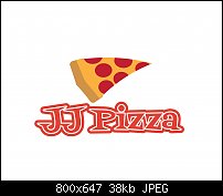
Assignment LOGO #13
This particular logo I have designed is actually a "rebranding" of JJ Pizza in Chicago. JJ, the client, said that they wanted to keep their particular shade of red for their primary color for the logo. I stayed up late last night learning HOW to make a double stroke in AI. I had to watch multiple videos before I finally got it (slow learner here). But once I learned it I knew I'd find use for it one day. Well, today is that day. When I created this image, not only did I use the double stroke on the "JJ" but I also made sure that I used the EXACT color (shade of red) the client required. I chose this font because of its triangle shaped serifs that reminded me of the shape of a slice of pizza. The pizza icon was fairly easy to make but I deliberately used a different shade of red for the pepperoni because the same shade of red would have made the logo look two dimensional and I wanted more "depth" to this icon. I also warped the icon after creating it so that it would look nice and hot with gooey melted cheese.
Impressions? I love this image. It makes me want some pizza for supper tonight. I feel this is a very entertaining logo as well as iconic enough for use on a business card. Cons? I don't know if strokes are okay on a logo, if the strokes will show up in a scaled down image for printing. But I figure, the double stroke is better than a single stroke anyway.
So, how did I do? Do you feel JJ would be a happy camper with this logo? Do YOU like it, yourself?
Mark
P.S...I checked to make sure that the title of the company was "JJ pizza" and NOT "JJ's Pizza".
 Member
Mark,
For the JJ logo, it would depend on how the customer wants to use the logo. I think it will work great for Web and flyer use. However, if the customer was going to use it for a letter head, I do not see it working well.
You also mentioned a business card, I don't think it will work in this case. Once you shrink the logo down for use on a business card will you will loose the word pizza or is it still legible? I am not sure.
I do like the JJ with the stroke and think this is a strong point in the design.
Ray
 Member
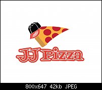
I too would likely enlarge the word Pizza. It is the main business of the establishment, yes? As it is, it's more an afterthought.
Oh, and Mark...you make the same statement in 99% of these posts...I love this image. Of course you likely do. That's a given. You've invested the thought and time to create it!
Mike
Member
You're right, Ray. I will change it!
Member
Yep, the word pizza should be the same size as the "JJ". Done!
Member
The icon leaves me a little cold, not much to look at. Maybe this will spruce things up a bit:
Member
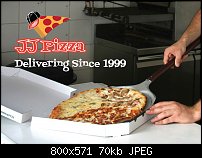
Mockup...
Member
Assignment LOGO #14
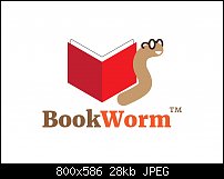
This logo is from an online bookstore. The client had absolutely no clue what to expect in their logo. If I were working with a real client here, I would have asked a LOT of questions about what they want/like or don't want/don't like. I like the eyeglasses on the worm, fun stuff to create. The book actually took longer to create than the worm, getting the book's pages to look right was not fun.
Impressions? Definitely a cool image, especially with the mockup! In the flat design logo I did not put a stroke around the text but in the mockup I did. I felt it needed it. Cons? While this is a fun image, I still feel it was kindda trite. But if I were the client I would still love having this logo. It just feels right.
So, what do you think? Did I nail the image? If you were the client, would you like this image?
Mark
P.S...I think the mockup image made the overall theme fun and exciting!
P.S.S...The client, not me, trademarked the logo.
 Member
Just being picky, here, but wouldn't it be better if the worm was looking at the book?
Moving the worm to the left of the book would do it, I think.
Or even placing the worm behind the book so that enough of it was showing to be recognizable as a worm.
Also changed the colours to reduce the number used. I always try to get down to 4 in total.
Bob.
Last edited by iamtheblues; 21 June 2017 at 01:21 PM. Reason: Add Graphic
** Detailed "Create A Spinning Logo Tutorial" is available in .pdf format for download at this link **
Outside of a dog, a book is a man's best friend. Inside of a dog, it's too dark to read. Groucho Marx.
 Posting Permissions


 Reply With Quote

Bookmarks