Your best so far, Mark. Fun text!
Bob.
Your best so far, Mark. Fun text!
Bob.
** Detailed "Create A Spinning Logo Tutorial" is available in .pdf format for download at this link **
Outside of a dog, a book is a man's best friend. Inside of a dog, it's too dark to read. Groucho Marx.
I believe I miss labeled yesterday's assignment as #3. When in fact it was #4.
Today's assignment is LOGO #5
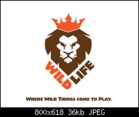
WildLife is a wild life habitat for animals around the world. It is a non-profit organization and (I assume) is privately owned and operated. They want a logo that is predominately an icon but text too is fine. I spent a little time on the sketchbook, realizing that I am not an artist and can't draw an animal. When I went to the computer, I was deciding on a lion as my icon. And I DID try my hand at drawing a "cartoon" lion (flat design) but I found out after quite some time that I suck at drawing lions too, even on the computer. So, I decided to find an iconic image of a lion on pixabay. I found one that was perfect for what I needed. And it looked FANTASTIC with text!
Impressions? I love this image, albeit it's not perfect (at least not the mockup anyhow). The slogan is not spaced correctly. But after an eternity at the computer, I've decided to quit while I was ahead. Cons? I HATE making the mockup! The reason is because when I went to save it as a jpeg, there was "something" on the palette that I could not find in the layers guide and I could not see it even when I put the image into wire view. So, I saved it with this HUGE bounding box that was about twice the size of the image I had created. Then I opened the jpeg in AI and cropped the jpeg and then traced it with the bitmap tracer (built in).
So, did I create a nice logo or not? If you were the client would you like this logo? I would like to think it's an excellent logo but a terrible mockup ad.
Mark
Angry lion. Not so much the mouth but the eyes. I would drop the giraffe and elephant as they only detract. I like the tagline.
I cleaned up the tagline so that it would read better and I removed the "gray" areas in the face of the lion so that it would look more "iconic". Plus, as a side benefit, taking out the gray also made the lion look less angry.
Now I found something else that needed my attention. The caps in "Wild and Life" should not have been caps but all small caps only so that they would flow more smoothly around the lion's head:

Last edited by Mark321; 13 June 2017 at 12:38 AM.
Assignment LOGO #6

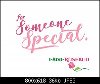
1-800-Rosebud is an online flower shop that sells flowers and gifts for any occasion. They wanted a wordmark that was legible at small sizes and a flower (it could be a rose or other flower). They said that they would prefer to have warm colors over the cool colors. I sketched a handful of ideas and went right away to work on this image. Surprisingly, the name on a curved path just didn't look good (even though I used the exact same path as the stem of the rose icon). Other paths didn't work either; it was just too messy looking. So, I settled on a normal straight line path. The rose was fairly easy to construct once I had my image down on paper. The colors came from a swatch that had flower colors in it.
Impressions? I really like the slanted "o" in rose and the flower pointing the change in color in the word "rose". The mockup was more fun than the wordmark (the flower was fun too.). I enjoy couching the work I do in mockups. It lets the client see the logo in context. Cons? The only thing that might could be different would be to make the flower stem pink too.
So, how'd I do? Is this something you feel a client might like? You're the judge!
Mark
Bookmarks