Federation Against Software Theft actually exists.
Also Japanese Sharp Corporation making electronics would not be very happy if kitchen knife manufacturer was using their company name for making knives.

 Member
Federation Against Software Theft actually exists.
Also Japanese Sharp Corporation making electronics would not be very happy if kitchen knife manufacturer was using their company name for making knives.
 Member
Theinonen, Very true. And keep in mind, as long as these companies were not competitors then it's not likely that one company would sue the other in an international court. However, if they both sold the same thing (either both sold electronic products or they both sold kitchen cutlery) then they would go after each other with a passion that transcends death! LOL! But the courts would always rule in favor of who registered their name FIRST as a company (so the Sharp Electronics Corporation would win hands down because they were around a lot longer).Originally Posted by theinonen

Mark
Member
Assignment LOGO #18
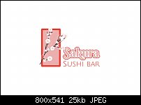
This company is a restaurant (sushi bar) and the company owner wanted to use the literal interpretation of Sakura (which means "Cherry Blossom") as an icon in their logo. They were not particular about the colors but I found a nice vector graphic on Pixabay that used a pink/salmon color that I could cross-over into the text. I think the colors are beautiful and allude to the fish that is served there. I chose a font that made me think of Japanese writing without actually being Japanese writing.
Impressions? What a lovely color scheme. I really like it. Plus, I like how I have the icon is just barely overlapping the "S" in Sakura. I also like the border around the icon. It gives the text something to align to. Cons? If I had to do it all over again (the mockup), I would have mentioned something about the buffet in the picture and maybe even in the title, although the owner said nothing about a buffet. It was just in the picture.
So, lovely or ludicrous? Did I do good or not? If you were the client, would you enjoy eating at this establishment (passing judgement purely on the logo alone)? Are you into sushi (I've never tried sushi myself)? Maybe I will after today's assignment.
Mark
Last edited by Mark321; 25 June 2017 at 12:38 PM.
 Member
Brilliant first time. One if my favourites and I don't even like Sushi!
Member
Thanks for the thumbs up, sculptex. I like this one too. But I couldn't read the title (not enough contrast). So I added a black stroke to it. It reads much more clearly now.
I've never tried sushi. I don't know if I'd like it or not. And of course I will try it.
 Member
Eating sushi and/or sashimi for the first time is an experience to be savored. So if you really do go, pick a good place because the experience is more than just the food. A good sushi bar should have a location to watch the chefs prepare, warm saki, a quite and respectful atmosphere.
Even though I have eaten at many establishments, our (my wife and children) best experiences have always been with friends at their home where it is just food thoughtfully prepared and enjoyed by all.
Member
Sounds delicious, Mike. I REALLY am going to try it.
Mark
Member
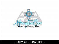
Assignment LOGO #19
This one nearly killed me.
Every now and then a client will come along who thinks they know everything. Of course, it is wise (if you want the job) to try to placate their needs and maybe show them the error of their ways (like that's possible). This particular client wants EVERYTHING in the logo, including the kitchen sink. They want a mountain, animals, text and a cross (representing the healing arts).
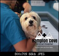
By the time I put all that stuff in there, it looked cluttered to me. But I kept re-arranging it over and over again. And although I personally would never put this much STUFF in a logo, this is for the client and not me. Hampton Cove is an animal hospital which, as I understand it, has a lovely view of a mountain range nearby (so what).
Impressions? Although this looks kindda busy to me, I still like it. It wasn't easy cramming all those icons into one image. Cons? The client is fictional so I can't talk them out of some of the stuff in this image. But if they were real, I could talk some sense into them. I would show them how they want it and then show them how good it could look without all that stuff in one image. Plus, all that stuff makes the logo so busy that the only way they could put this image on a business card is to put it all by itself on one side of the card and then put all the other information on the back of the card.
So, given I had one heck of a morning trying to make all this stuff work, how'd I do? Be fair here because it wasn't easy to do. Do you think this imaginary client would be happy with this?
Mark
 Member
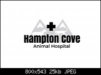
As the design is cluttered (not your fault, obviously). I think the design would benefit from the text being much more simple than you have made it.
Why not try a sans serif font in two different weights and just the one colour. It could improve a difficult task.
The white outline on the text is unnecessary and confusing as it is fighting with the design behind it.
You really must be brutal if you cannot drop any of the elements, to pare down what you have to have to the barest minimum.
Bob.
** Detailed "Create A Spinning Logo Tutorial" is available in .pdf format for download at this link **
Outside of a dog, a book is a man's best friend. Inside of a dog, it's too dark to read. Groucho Marx.
Member
YESSSS!!!!!!!!!!!!
Bob, you are amazing (as always)! I feel this is MUCH better! I could not have done it without your wisdom. And your gracious spirit to share that wisdom.
Mark
The mountains were a little sloppy as there were originally 3 of them. I erased the middle one to make room for the cross. I re-did the mountains and now they look better:
 Posting Permissions

 Reply With Quote

Bookmarks