Welcome to TalkGraphics.com
Page 1 of 20 12311 ... LastLast
Results 1 to 10 of 199
  1. #1
    Join Date
    Apr 2015
    Location
    Colorado USA
    Posts
    710

    Default Mark321's THIRTY LOGOS assignments

    Assignment LOGO #1

    Click image for larger version. 

Name:	SPACE  LOGO.jpg 
Views:	296 
Size:	14.9 KB 
ID:	117861

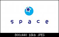
    This logo is for an office space company that has locations in different cities around the world. My concept development was to create an icon that represented outer "space". First I created an image of a planet with some stars surrounding it. I didn't like that idea. So then I created a sketch of a planet with a ring around it (i.e. Saturn). But while it took quite some time to get the ring just right, I found it looked more iconic if I just left the ring out all together and put a star inside of the planet. I used a science fiction type font to create the text and spaced the text out to communicate the idea that there is "space" in the company called SPACE.

    Impressions? I am VERY pleased with this image. I designed it so that colors could be added later and the logo has the ability to be "scaled down" to incredibly small sizes and still be legible. It feels very elegant and communicates much in such a small space (no pun intended). Of course, the client is fictional so there's no feedback on any changes that might be necessary.

    So, what do you think, my friends? Did I create a pretty nice image? It's just assignment number one, many more to go!

    Mark

    Possible color version:

    Click image for larger version. 

Name:	SPACE  LOGO in color.jpg 
Views:	208 
Size:	15.6 KB 
ID:	117862

  2. #2

    Default Re: Mark321's THIRTY LOGOS assignments

    nice and simple.

  3. #3
    Join Date
    Apr 2015
    Location
    Colorado USA
    Posts
    710

    Default Re: Mark321's THIRTY LOGOS assignments

    Quote Originally Posted by sculptex View Post
    nice and simple.
    Thank you, sculptex!

  4. #4
    Join Date
    Jun 2017
    Posts
    5

    Default Re: Mark321's THIRTY LOGOS assignments

    I like the icon with the colors! Did you try capital letters? I wonder what it would look like.

  5. #5
    Join Date
    Dec 2007
    Location
    Sunshine Coast BC, Canada. In a beautiful part of BC's temperate rainforest
    Posts
    9,864

    Default Re: Mark321's THIRTY LOGOS assignments

    It is as others have said clean and simple and I like the use of simple geometric shapes and the extra space between letters. But this doesn't say office space to me I see space exploration, or a sci Fi movie channel.

    Try swapping out the star for a cube and use a font that you would think of being used in an office environment. Perhaps something san serif.

    here is a quick example of how you could use simple shapes to create a cube (yes I know its not perfect )
    Attached Images Attached Images  
    [SIGPIC][/SIGPIC]
    My current Xara software: Designer Pro 365 12.6

    Good Morning Sunshine.ca | Good Morning Sunshine Online(a weekly humorous publication created with XDP and exported as a web document) | Angelize Online resource shop | My Video Tutorials | My DropBox |
    Autocorrect: It can be your worst enema.

  6. #6
    Join Date
    Apr 2015
    Location
    Colorado USA
    Posts
    710

    Default Re: Mark321's THIRTY LOGOS assignments

    Quote Originally Posted by Dreymel View Post
    I like the icon with the colors! Did you try capital letters? I wonder what it would look like.
    Yes, Dreymel. I DID try all caps but there wasn't much difference from the small letters. The letters looked (to me) better small than large.

    Mark

  7. #7
    Join Date
    Apr 2015
    Location
    Colorado USA
    Posts
    710

    Default Re: Mark321's THIRTY LOGOS assignments

    Quote Originally Posted by angelize View Post
    It is as others have said clean and simple and I like the use of simple geometric shapes and the extra space between letters. But this doesn't say office space to me I see space exploration, or a sci Fi movie channel.

    Try swapping out the star for a cube and use a font that you would think of being used in an office environment. Perhaps something san serif.

    here is a quick example of how you could use simple shapes to create a cube (yes I know its not perfect )
    LOL! Frances! When I was brainstorming ideas I didn't come up with your idea, wished I had because that would have been a great concept! And like I said earlier, there's no real client to bounce ideas off of or show your work to so you can get feedback. But, hey, it's free training so I'm not complaining. It's a lot of fun getting feedback from you guys! You make it seem worth while. Too bad I don't get college credit for this. But I AM making a portfolio book to put EVERYTHING in, including the briefs and my sketches. I bought a special book to keep it all in. And when I am finished with this course, in 30 days, I will be a better logo designer! Not to mention, I will also be better at AI!

    I maybe make 10 or so logos a year (not many) but I hope to do more after this course. It's my specialty that I love. Since I didn't go to design school but I've had a couple of online design classes and a few art classes over the years but they were all pretty much "generic" courses, nothing specific. But this course is specific. It only deals with logo design. And this will be a big plus to share with potential clients in the future, especially bigger clients. I mostly do small businesses. But who knows where this can lead!

    Mark

    P.S...The "fictional" client suggested that I look at their competitors' websites to get a feel for the look. When I designed it I knew that this company would need help in competing with their collages in the profession. So, I designed something that looked somewhat like their (the other companies') logos but I decided that this company needed an extra "kick" to position themselves apart from the competition as a better marketing strategy. Incidentally, their competition was two REAL companies online.

    P.S.S...I also learned how to use the knife and clipping mask in AI. Learn something new everyday
    P.S.S.S...I created a new version based on Frances' recommendations:

    Click image for larger version. 

Name:	SPACE  LOGO gold text.jpg 
Views:	202 
Size:	23.1 KB 
ID:	117869
    Last edited by Mark321; 08 June 2017 at 09:28 PM.

  8. #8

    Default Re: Mark321's THIRTY LOGOS assignments

    Loose the gradient on the text.

    It is (almost) OK for a web site for an effect--but still not on the logo. They are generally a poor idea for use in an identity. With the spacing in the wording, adding "space" due to the fading of the gradient is too much.

    As for color, pick one from the cube and use it. Also make sure how well those differentiate if reproduced in B/W (grayscale). General tidiness of the cube would be a good idea as well.

    Mike

  9. #9
    Join Date
    Apr 2015
    Location
    Colorado USA
    Posts
    710

    Default Re: Mark321's THIRTY LOGOS assignments

    Quote Originally Posted by mwenz View Post
    Loose the gradient on the text.

    It is (almost) OK for a web site for an effect--but still not on the logo. They are generally a poor idea for use in an identity. With the spacing in the wording, adding "space" due to the fading of the gradient is too much.

    As for color, pick one from the cube and use it. Also make sure how well those differentiate if reproduced in B/W (grayscale). General tidiness of the cube would be a good idea as well.

    Mike
    Agreed.

  10. #10
    Join Date
    Apr 2015
    Location
    Colorado USA
    Posts
    710

    Default Re: Mark321's THIRTY LOGOS assignments

    This is my last attempt. Tomorrow is a new assignment!

    Click image for larger version. 

Name:	SPACE  LOGO final image.jpg 
Views:	172 
Size:	28.0 KB 
ID:	117874


Bookmarks

Posting Permissions

  • You may not post new threads
  • You may not post replies
  • You may not post attachments
  • You may not edit your posts
  •