


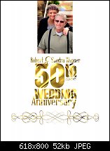
This image is a flyer I designed for my parents which will be given away to those who come to the celebration. However, I'm NOT entirely happy with it because the fill I'm using is the closest one to looking anything like real gold, which makes the text difficult to read. I tried to use a contour around the whole headline but for some unknown reason the contour tool would either make a transparent color for the line or it would just expand the fill color, neither of which I wanted. I tried a glow shadow but the shadow, no matter how much I nudged it, just didn't look good. If you know WHY my contour tool has gone loopey, please explain it to me.
Frustrated as heck,
Mark
P.S...I tried to use script font on the word "Anniversary" but the font in gold looked totally unreadable. Plus, I can't use a nice background image because I have to print several of these on my home printer and I gotta use the ink sparingly.

 Reply With Quote

 Thanks!


Bookmarks