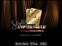
I'm not sure what you mean. Like this?Originally Posted by Boy


 Member
I'm not sure what you mean. Like this?
 Member
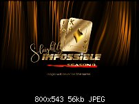
Yes, better but it still doesn't really match the rest of the design and it also attracts the eye too much. I noticed you changed the background color as well.
Member
Now, I get it! How's this?
Member
Yes, it's again better . Not sure about the new background color though.
Member
Boy,
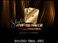
Here I made the background curtains more chocolate and less orange. Is this better?
Mark
Member
There are too many elements in this picture now and they don't really come together. I'm not really sure how to proceed from here.
 Moderator Posthumous
I agree with Boy "Sure. It's a lot of gold but I like this one better than the earlier ones. It's also better readable. However, you could adjust the big diamond at the center of the card so that it looks like gold with reflections rather than a separate gold object." . I like this one (post #9)a lot.
EDIT: Perhaps simplify the background color to a dark red that harmonizes with the gold and brighten up the text "Magic will never be the same" Just a quick thought before I have to leave. I'll check back later.
Last edited by wizard509; 07 May 2017 at 06:08 PM.
Larry a.k.a wizard509
Never give up. You will never fail, but you may find a lot of ways that don't work.
Member
Loving it Mark!
 Posting Permissions

 Reply With Quote
Bookmarks