Personally, from the sample size I'm not certain you are going to get an exact match. Helevtica Neue looks pretty darn close.
But how's this?


 Member
Personally, from the sample size I'm not certain you are going to get an exact match. Helevtica Neue looks pretty darn close.
But how's this?
New Member (No PMs)
Better quality here :
http://vignette4.wikia.nocookie.net/...20140802091530
 Moderator Emeritus
Not really. Harder to see.
How do you plan to use this?
Gary W. Priester
Mr. Moderator Emeritus Dude, Sir
gwpriester.com | eyetricks-3d-stereograms.com | eyeTricks on Facebook | eyeTricks on YouTube | eyeTricks on Instagram
New Member (No PMs)
Oups no, indeed.. not really what i wanted to do.
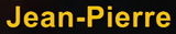
I'm looking for the perfect font for my subtitles.
New Member (No PMs)
not too thin, not too thick, we can see that the "e" and the "a" are differents, and the letters are more spaced out from arial or helvetica.
Member
Spacing means nothing. That's just kearning.
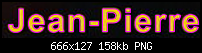
Thanks for a slightly better image.
 Super Moderator
The image is lifted from Inglourious Basterds so there are bound to be more captions you can find.
Try contacting the production company and asking them: The Weinstein Company.
Acorn
Acorn - installed Xara software: Cloud+/Pro+ and most others back through time (to CC's Artworks). Contact for technical remediation/consultancy for your web designs.
When we provide assistance, your responses are valuable as they benefit the community. TG Nuggets you might like. Report faults: Xara Cloud+/Pro+/Magix Legacy; Xara KB & Chat
Member
So...Originally Posted by Thomas94

Here's another. The font is outlined in magenta with no fill so you can see your latest screen shot under it. Tracking is set to push the letter forms wider.
 Posting Permissions

 Reply With Quote

Bookmarks