hahahaha...that was my change, albeit a small one, while you were busy composing your responseOriginally Posted by Gare


 Member
hahahaha...that was my change, albeit a small one, while you were busy composing your response
 Member
Just one more customer the #34 version is great
 Super Moderator
Thanks very much to all for your kind comments and suggestions.
Mickymopar: I did try the brush, but, it didn't fit in with what I was trying to do. I tried again, but then things were getting too crowded, and I found myself trying to move everything.
Gary: I always think carefully about which fonts I'm going to use, though I am limited by what I have installed. And I can't say that I always choose the correct ones.
So, the fonts I used, seemed to fit the bill, the way I looked at things.
I can't say that I thought about putting a value on the chips, though.
I was so caught up with how to do them, that the value was not in my mind.
I was trying to use the 3D Extrude tool, but it's not ideal, when on the edge, you have more than on element.
So, I spent quite a lot of time seeing how to get the best result from the 3D tool.
The one thing I did take your advice on, was to move away from my initial design, where things were symmetrical. That's a lesson I continually forget.
Once again, thanks everyone for the comments and advice and guidance.
Featured Artist on Xara Xone . May 2011
. A Shield . My First Tutorial
. Bottle Cap . My Second Tutorial on Xara Xone
Super Moderator
I wanted to have another go, with a lot of the original elements.
What do you think?
Featured Artist on Xara Xone . May 2011
. A Shield . My First Tutorial
. Bottle Cap . My Second Tutorial on Xara Xone
Member
Looks really good to me Rik, another neat image.
Stygg
 Super Moderator
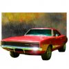
That's stunning, Rik, from many aspects. The red is a hot color—warm=inviting, cool=repels, The limitation to red, white, and black simplifies and brings elements together, the use of the dice to point to the text is great, the apparent randomness of placement of the shapes suggest the "chaos", the randomness at winning at a casino.
I read the headline first, the text second.
You win, pal! \My Best,
Gary
Member
Thought I'd try a bold header and your brush Gary.
Stygg
Super Moderator
Thanks for your kind comments, Gary and Stygg.
It's always very good to get feedback from the professionals.
And Stygg: What a great use of the Brush, to go around the invitation details. That is really, really good. I like it.
Featured Artist on Xara Xone . May 2011
. A Shield . My First Tutorial
. Bottle Cap . My Second Tutorial on Xara Xone
Member
Glad you liked the use of the brush and thanks for your kind comment Rik but I'm no professional, pure hobbiest who loves the Xone
Stygg
Last edited by stygg2003; 02 April 2015 at 04:33 PM.
 Moderator Posthumous
Rik I really like the Red background on this one.
Larry a.k.a wizard509
Never give up. You will never fail, but you may find a lot of ways that don't work.
 Posting Permissions

 Reply With Quote


Bookmarks