November's gained a 2nd R
N says Negative to me.


 Member
November's gained a 2nd R
N says Negative to me.
Egg
Intel i7 - 4790K Quad Core + 16 GB Ram + NVIDIA Geforce GTX 1660 Graphics Card + MSI Optix Mag321 Curv monitor + Samsung 970 EVO Plus 500GB SSD + 232 GB SSD + 250 GB SSD portable drive + ISP = BT + Web Hosting = TSO Host
 Member
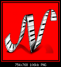
Nice one Egg...did you use a real negative or did you draw this one? I was hoping to find a hidden treasure when I zoomed into the N. Is it a different season in Novemberr'? Thus creating a cold edge to the N?
 Moderator Posthumous
That's great Egg. It looks like a real negative. If you don't mind small criticism. Tihe N is hard to see, so couldn't it be lighter without destroying the negative effect? Just wondering.
Larry a.k.a wizard509
Never give up. You will never fail, but you may find a lot of ways that don't work.
Member
Veeness/Larry,
Thanks for the comments. I did a search on Google for Negative images and there were only a few re film negatives. The one I chose had ducks. I did some photo healing to remove most of the visible ducks, just wanting an undestingishable negative background (I had previously tried to recreate it using fractal fills but couldn't get the desired effect). The remainder of the image, sprocket holes, text numbers and the "N" are vector.
As for your point Larry, maybe. I just used the colour picker to select the whitest part of the original bitmap. Negatives, now a thing of the past, were never easy things to fathomBut I take your point, it would be difficult to use as a real Drop Cap.
Egg
Intel i7 - 4790K Quad Core + 16 GB Ram + NVIDIA Geforce GTX 1660 Graphics Card + MSI Optix Mag321 Curv monitor + Samsung 970 EVO Plus 500GB SSD + 232 GB SSD + 250 GB SSD portable drive + ISP = BT + Web Hosting = TSO Host
Moderator Posthumous
Thanks for your understanding Egg. You did a wonderful job on the negative but as you say not usable as a drop cap. Though it could be by lightening the N without destroying the negative effect.
Larry a.k.a wizard509
Never give up. You will never fail, but you may find a lot of ways that don't work.
Member
Hi All,
I haven't posted here in years but I stopped by and saw this challenge and it look like a lot of fun, so I thought I'd give it a try. Not sure what the image size rules are but I hope this is OK. I reduced it in size a great deal. I made the image in ArtRage 4.5. The N is made with a something called a sticker that I created. I also created the tile with the ArtRage Symmetry tool.
Attachment 104651
Last edited by Aunt Betsy; 11 November 2014 at 11:30 AM.
Aunt Betsy
Moderator Posthumous
Glad you joined in Aunt Betsy. You did very well and I like it. There are no size limitations in this challenge.
@ ALL Drop caps can be any size, but the best practices seem to be where the top of the first letter of the first word lines up with the top of the first sentence and drops down two or more lines and replaces The first letter of the first word. So with this in mind they should be designed so they look good even at a small size. Sort of icon size. If they look good small then great. Bob (If I recall correctly) showed where it could take up almost a whole page, but that isn't normal today and I personally find that overkill. I often see them the as a decorative element at the beginning of a story (mostly faerie tales) but they can be used anywhere.
INITIAL CAPITALS have historical roots in the early days of book design; their use predates the printing press and the invention of moveable type. Todays initial caps are not as fancy as those carefully rendered in gold leaf in ancient scriptorium, but their association with classic book design remains strong. Initial Capital letters are often referred to generically as drop caps though a drop capital is actually a specific style of Initial Cap.
Some modernists discourage the use of initial caps, citing a host of typographical probems, but Once upon a time just wouldnt be the same with*out a great big letter O at the beginning. Though not appropriate for every book, initial caps announce the beginning of a chapter with classical style. They suggest that the text you are about to read transcends mere data; this is literature.
Most of this information was gathered from various places on the web and as far as I can tell it is accurate.
Here are a few examples I found on the web. As you can see most of these are fairly large.
Larry a.k.a wizard509
Never give up. You will never fail, but you may find a lot of ways that don't work.
Member
Nice one Betty)) just in time for christmas
 Member
"last minute" for drop cap of november
The N of "piano keys " project
Max
Member
 Posting Permissions


 Reply With Quote
Bookmarks