


Glad you joined in Aunt Betsy. You did very well and I like it. There are no size limitations in this challenge.
@ ALL Drop caps can be any size, but the best practices seem to be where the top of the first letter of the first word lines up with the top of the first sentence and drops down two or more lines and replaces The first letter of the first word. So with this in mind they should be designed so they look good even at a small size. Sort of icon size. If they look good small then great. Bob (If I recall correctly) showed where it could take up almost a whole page, but that isn't normal today and I personally find that overkill. I often see them the as a decorative element at the beginning of a story (mostly faerie tales) but they can be used anywhere.
INITIAL CAPITALS have historical roots in the early days of book design; their use predates the printing press and the invention of moveable type. Todays initial caps are not as fancy as those carefully rendered in gold leaf in ancient scriptorium, but their association with classic book design remains strong. Initial Capital letters are often referred to generically as drop caps though a drop capital is actually a specific style of Initial Cap.
Some modernists discourage the use of initial caps, citing a host of typographical probems, but Once upon a time just wouldnt be the same with*out a great big letter O at the beginning. Though not appropriate for every book, initial caps announce the beginning of a chapter with classical style. They suggest that the text you are about to read transcends mere data; this is literature.
Most of this information was gathered from various places on the web and as far as I can tell it is accurate.
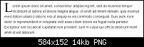
Here are a few examples I found on the web. As you can see most of these are fairly large.

 Reply With Quote


 Nice
Nice

Bookmarks