Just look at the Phone and/or Tablet specs;
There are multiple most used screensizes for you to copy and apply
Hans

 Member
 Re: Beware the difference between Mobile Screen Resolution & Browser Window Resolutio
Just look at the Phone and/or Tablet specs;
There are multiple most used screensizes for you to copy and apply
Hans
 Member
Re: Beware the difference between Mobile Screen Resolution & Browser Window Resolutio
Member
Re: Beware the difference between Mobile Screen Resolution & Browser Window Resolutio
Mike,
If I Google it I get 960 x 540 (not being argumenativeMotorola Droid 4. Looking online, the display is suppose to be 960 x 480.)
My point is that if your screen resolution is is 960, in landscape it should serve up the 960 px variant, not the 720 variant. The portrait resolution is 540 px (some dispute re our Google search resolutions here) so I would expect it to serve up the 480 variant as it's less than 600 px.Going to your test site with the phone in landscape orientation, the site displays the 720 variant. Rotating the phone to portrait, it switches to the 480 variant.
I'm sounding more and more like a voice in the wilderness here
Egg
Minis Forum UM780XTX AMD Ryzen7 7840HS with AMD Radeon 780M Graphics + 32 GB Ram + MSI Optix Mag321 Curv monitor + 1Tb SSD + 232 GB SSD + 250 GB SSD portable drive + ISP = BT + Web Hosting = TSO Host
Member
Re: Beware the difference between Mobile Screen Resolution & Browser Window Resolutio
Just tested it on xperia z compact and had different readings on screensize
I use a nongeneric browser on this Phone but it is different when I set it to fullscreen or normal view
Seems to be using a viewport of some kind.
But by the resolution definition by sony it should be 1280x720 pixels
(360 x640) is it's viewport(I guess)
Your page came close to the latter specs,give and take a pixel or 20
Hans
Member
Re: Beware the difference between Mobile Screen Resolution & Browser Window Resolutio
Cheers for that Hans. I'm just finding this confussing and wonder if anyone can enlighten me on this subject.
Egg
Minis Forum UM780XTX AMD Ryzen7 7840HS with AMD Radeon 780M Graphics + 32 GB Ram + MSI Optix Mag321 Curv monitor + 1Tb SSD + 232 GB SSD + 250 GB SSD portable drive + ISP = BT + Web Hosting = TSO Host
 Member
Re: Beware the difference between Mobile Screen Resolution & Browser Window Resolutio
Member
Re: Beware the difference between Mobile Screen Resolution & Browser Window Resolutio
I have seen various resolution, even one at 480×854, which for the long aspect is odd. But that was on Motorola's site. It's just that there are so many models, sub-models and rebrandings, only God knows what mine really is.Originally Posted by Egg Bramhill

I could look it up in the manual. If I could find it.
As is being mentioned, viewports and screen size are not the same, though.
Member
Re: Beware the difference between Mobile Screen Resolution & Browser Window Resolutio
Oh, yeah. Are you accounting for the pixels used in the vertical scroll bar?
Member
Re: Beware the difference between Mobile Screen Resolution & Browser Window Resolutio
No I don't think that makes a great difference on mobile browsers, their scroll bars are at best 10 px wide.Oh, yeah. Are you accounting for the pixels used in the vertical scroll bar?
Egg
Minis Forum UM780XTX AMD Ryzen7 7840HS with AMD Radeon 780M Graphics + 32 GB Ram + MSI Optix Mag321 Curv monitor + 1Tb SSD + 232 GB SSD + 250 GB SSD portable drive + ISP = BT + Web Hosting = TSO Host
Member
Re: Beware the difference between Mobile Screen Resolution & Browser Window Resolutio
Exactly. Say you wanted to impress a client who you knew had a mobile with a resolution of 480 x 850 and instead of delivering an 480 sized page it displays a 240 px sized page. I understand that Xara veriant pages are not 100% responsive, just trying to understand what they should deliver and an easy formula for calculating the same.As is being mentioned, viewports and screen size are not the same, though.
As for screen resolution, window browser size and viewports, I'm looking for clarification
Egg
Minis Forum UM780XTX AMD Ryzen7 7840HS with AMD Radeon 780M Graphics + 32 GB Ram + MSI Optix Mag321 Curv monitor + 1Tb SSD + 232 GB SSD + 250 GB SSD portable drive + ISP = BT + Web Hosting = TSO Host
 Member
Re: Beware the difference between Mobile Screen Resolution & Browser Window Resolutio
Member
Re: Beware the difference between Mobile Screen Resolution & Browser Window Resolutio
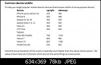
This might be of help (edit: I added a picture because posting my reply removes the extra spacing to make it read easier)
Pasted from Xara V10 release notes:
Common device widths
To help you target popular mobile devices here are the browser widths of some popular devices
Device upright sideways
iPhone up to version 4s 320 480
iPhone 5 320 568
Galaxy S3, S4, S5 360 640
Galaxy Note (1,II, 3) 360 640
Nexus 5 360 640
HTC One 360 640
Tablets:
iPad (all models) 768 1024
Nexus 7 600 960
Nexus 10 800 1280
Kindle Fire HD 534 802
Note the actual resolution of the screen is typically much higher than the values shown above - the values shown here are ‘CSS pixels’ which are not the same things as screen pixels.
...
And to answer your question... those were the variants that I was getting for portrait (480) and for landscape (720).
Member
Re: Beware the difference between Mobile Screen Resolution & Browser Window Resolutio
Cheers Dutchim,
I'm now understanding this a little bit better.
Whilst this goes a long way to answering my original query, as does the attached table, I'm sure to most users it's just gobbly-gook.Note the actual resolution of the screen is typically much higher than the values shown above - the values shown here are ‘CSS pixels’ which are not the same things as screen pixels.
Can anyone point me in the direction of a simple explanation of this screen resolution / browser resolution / CSS pixels / screen pixels / viewport conundrum and even better a method to convert one to the other?
Egg
Minis Forum UM780XTX AMD Ryzen7 7840HS with AMD Radeon 780M Graphics + 32 GB Ram + MSI Optix Mag321 Curv monitor + 1Tb SSD + 232 GB SSD + 250 GB SSD portable drive + ISP = BT + Web Hosting = TSO Host

 Reply With Quote

Bookmarks