


 Re: Beware the difference between Mobile Screen Resolution & Browser Window Resolutio
The problem is that many devices have very dense screen resolutions - this makes their text and graphics very crisp to the eye.
When Apple introduced the retina screen, they doubled the number of pixels on each axis, really offering quadruple resolution.
So, if a page was viewed filling a non-retina screen, then the same page viewed on a retina screen would only occupy one quarter of that screen if pure pixel measures were used. It would be tiny and hard to read.
So instead, the effective pixel measure for the web page remains the same between non-retina and retina models, however the browser is able to render text and graphics more cleanly because the device can faithfully render quarter pixels.
Typically graphics can be supplied in two resolutions to cope with the density of the display - normal size and @2x resolution, (you'll see Xara supports this).
So what's happening is that Xara is seeing the reported resolution of the device "CSS pixels"but the physical resolution is much higher and is used to give text ,graphics and bitmaps much more clarity.
Does that make any sense? I've mentioned Apple, but the principle is the same for all mobile devices.
Mobile devices are small, generally so having a greater pixel density ( more pixels ) doesn't automatically mean you get to display larger web pages in the same space - after all your eyes don't get better at recognising fine detail and people don't want to look at pages as though they're twice as far away.
I do a lot of development on iPad and iPhone apps. When I place a image at (100,100) it will really be at hardware (100,100) for a non-retina iPad, but at hardware (200,200) on a retina screen. If I want a bitmap to be 200x200, on a non-retina screen it will occupy an area of 200x200 hardware pixels. On a retina screen it will occupy an area of 400x400 hardware pixels. If I provide only a 200x200 pixel image it will be scaled up on the retina device. Typically I can supply a higher resolution image for the retina screen with a @2x suffix (and a resolution of 400x400). So my inteded design is the same on either machin - physically the same size.
Apple refers to it's screen units as points not pixels, so the screen drawing area is independent of the pixel density of the display.
As I said, the same principle follows for other manufacturers as regards hardware resolution not matching the web page resolution. I deliberately didn't mention the iphone 6.
If you think all this is odd, exactly the same thing happens with your HD TV. Standard definition video would be a little box on the screen, so the image is upscaled to fill the available area. Your mobile does the same.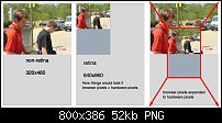

 Reply With Quote


 Re: Beware the difference between Mobile Screen Resolution & Browser Window Resolutio
 Originally Posted by mattwatt

 Acorn - installed Xara software: Cloud+/Pro+ and most others back through time (to CC's Artworks). Contact for technical remediation/consultancy for your web designs.

Bookmarks