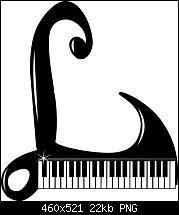
Max I don't know how I missed it before, but, I think your recent piano keyboard drop cap s great. Thanks for persisting.


 Moderator Posthumous
Max I don't know how I missed it before, but, I think your recent piano keyboard drop cap s great. Thanks for persisting.
Larry a.k.a wizard509
Never give up. You will never fail, but you may find a lot of ways that don't work.
 Member
Originally Posted by csehz
 Thanks to all,my friends
Member
Hi Larry, I've tried to follow your advices
this is the result
Moderator Posthumous
Much better Max. It does resemble a grand piano and the keys are much more visible now and I like it, how about you. I really really liked your post 43, did you decide against that one.
Larry a.k.a wizard509
Never give up. You will never fail, but you may find a lot of ways that don't work.
 Member
The font is Gothic Leaf, which in its basic form is just a black rectangle with the L shape and decoration cut away from it.
So I regarded this as a stencil, and placed a few brush strokes using Xara's Petal Brush and converted the lines to shapes.
This allowed me to add an outline to the former brush. I experimented with various coloured rectangles and contones until
I found something I was happy with, it puts me in mind of a stained glass effect. Unfortunately I wasn't taking notes as I
was making this, so it's unlikely that I could replicate it.
Bob.
** Detailed "Create A Spinning Logo Tutorial" is available in .pdf format for download at this link **
Outside of a dog, a book is a man's best friend. Inside of a dog, it's too dark to read. Groucho Marx.
Member
A variation of the above using a different contone and a bitmap texture from Filter Forge.
Bob.
** Detailed "Create A Spinning Logo Tutorial" is available in .pdf format for download at this link **
Outside of a dog, a book is a man's best friend. Inside of a dog, it's too dark to read. Groucho Marx.
Moderator Posthumous
Very attractive Bob. I have never tried the petal brush, but I'll have to look into it. Thanks. Isn't it amazing how we all have different ways of making a Drop Cap? Like the scribble it's simply amazing.
And, we all learn from these, and, that's why I consider the challenges such an important forum. I think this one is going into my collection of Drop Caps.
Larry a.k.a wizard509
Never give up. You will never fail, but you may find a lot of ways that don't work.
Moderator Posthumous
Glad to see I am not the only one using Filter Forge on these things. While I like this one, my personal taste says that the orange and the green are just too close in value.
EDIT AGAIN: I love the darker green used on this one.
Last edited by wizard509; 22 September 2014 at 02:35 PM. Reason: added the words the only one
Larry a.k.a wizard509
Never give up. You will never fail, but you may find a lot of ways that don't work.
Member
Thanks for your comments, Larry. I agree about post #55, which I why I posted the variation.
This new one is a mixture of vector (inner contour for the shiny gold effect and the frame), and raster for the outer glow, grunge, black background and the bevel.
The font is a great slab serif - Black Oak.
I was wondering if this design might be a bit over-the-top.
Bob.
** Detailed "Create A Spinning Logo Tutorial" is available in .pdf format for download at this link **
Outside of a dog, a book is a man's best friend. Inside of a dog, it's too dark to read. Groucho Marx.
Moderator Posthumous
Oh I don't know. Looks good Bob, and I think it might be effective.
Larry a.k.a wizard509
Never give up. You will never fail, but you may find a lot of ways that don't work.
 Posting Permissions

 Reply With Quote


Bookmarks