This month is L


 Moderator Posthumous
This month is L
Larry a.k.a wizard509
Never give up. You will never fail, but you may find a lot of ways that don't work.
 Member
Hi Larry, thanks for this month's challenge.
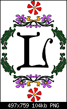
Of all the letters, I find I, J and L are the least interesting. So I was looking for a distinctive L to use this month. Attached is The Upper Case L from Nick's Fonts - Speedball No2 NF Bold.
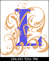
Despite the appearance of this drop cap, the result is pure vector. Not one pixel in the .xar file. What seem to be gradient fills are in fact inner contours with 500 steps, which create this metallic texture. If you were to copy the graphic into Illustrator, it would still be a bunch of vector shapes, which would not be the case if you were using gradient fills. (not that a gradient fill could follow the shape of the L in any case - or indeed the rounded rectangular frame) This is why the Contour tool is my favourite in the Xara toolbox, it's versatile, flexible and adaptable. This isn't the case in some other vector programs - how are contours working out for you guys using Serif DrawPlus?
Bob.
** Detailed "Create A Spinning Logo Tutorial" is available in .pdf format for download at this link **
Outside of a dog, a book is a man's best friend. Inside of a dog, it's too dark to read. Groucho Marx.
 Member
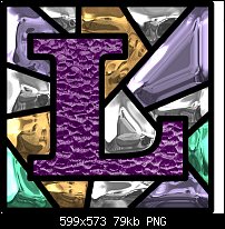
Webby has got me into cubes recently, so here's mine.
Egg
Intel i7 - 4790K Quad Core + 16 GB Ram + NVIDIA Geforce GTX 1660 Graphics Card + MSI Optix Mag321 Curv monitor + Samsung 970 EVO Plus 500GB SSD + 232 GB SSD + 250 GB SSD portable drive + ISP = BT + Web Hosting = TSO Host
Moderator Posthumous
I like those Bob and Egg. Cool and possibly rusty I-beams Egg.
I know Webby is a regular on XU, but does he ever visit and contribute to TG? If he needs an invitation please do.
Larry a.k.a wizard509
Never give up. You will never fail, but you may find a lot of ways that don't work.
 Member
Hi
"L" is my wife's name initial letter, I've "embroidered" this for her
Max
Moderator Posthumous
Pretty cool maxcon62. Just curious bow did you got that crochet look? Who knows, I may want to do that sometime.
Larry a.k.a wizard509
Never give up. You will never fail, but you may find a lot of ways that don't work.
Member
Max
That is a lovely piece of work. Great crochet effect.
 Posting Permissions

 Reply With Quote


Bookmarks