You are most welcome!


 Moderator Posthumous
You are most welcome!
Larry a.k.a wizard509
Never give up. You will never fail, but you may find a lot of ways that don't work.
Moderator Posthumous
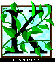
OK I finally got a few done.
some are side comparisons with and without the Filter Forge metalizer filter I am so fond of.
Larry a.k.a wizard509
Never give up. You will never fail, but you may find a lot of ways that don't work.
Moderator Posthumous
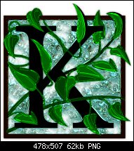
Here is another. Was an italic font but I changed it some. Once again I used the metalizer Filter Forge filter.
Larry a.k.a wizard509
Never give up. You will never fail, but you may find a lot of ways that don't work.
Moderator Posthumous
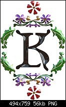
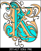
Here is another.
Took me awhile to figure out what font I had used before so"
this is:
Ornamental Versals
Ungroup twice
break shaqpes
2 pt line
Blue is linear fill
00f5f7 - 00f5f7
tan is ffc17f
Larry a.k.a wizard509
Never give up. You will never fail, but you may find a lot of ways that don't work.
 Member
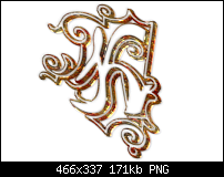
The font used here is Cheap Sign. I like the basic idea of the font, but the dot size is too large for my taste. So I redrew the dotted areas and clipped my own halftone pattern inside, which made the result less cartoony looking. The original font is inset in the attachment.
Bob.
** Detailed "Create A Spinning Logo Tutorial" is available in .pdf format for download at this link **
Outside of a dog, a book is a man's best friend. Inside of a dog, it's too dark to read. Groucho Marx.
Moderator Posthumous
Good job Bob, I think I'll look up the font so I can see how yoy changed it, just to satisfy my couriosity. I'm glad I'm not alone doing these drop caps. Keep em coming.
Larry a.k.a wizard509
Never give up. You will never fail, but you may find a lot of ways that don't work.
Moderator Posthumous
I think I like yours better than the original font Bob. The original does look more cartoony.
Larry a.k.a wizard509
Never give up. You will never fail, but you may find a lot of ways that don't work.
 Member
I try to create some "modern" Drop Caps.


. i
Moderator Posthumous
You were. Busy Igor. Not sure if I like one any better than another. They all look good.
Larry a.k.a wizard509
Never give up. You will never fail, but you may find a lot of ways that don't work.
Member
As I have a bit more time in August, I thought I'd try a drop capital. The font is Vivian and it's supposed to be a kind of jewelled effect.....
Last edited by Penny O'Rorke; 12 August 2014 at 03:31 PM.
 Posting Permissions

 Reply With Quote

Bookmarks