Hello
Could someone tell me what font is this one?
Thank you!

 New Member (No PMs)
Hello
Could someone tell me what font is this one?
Thank you!
Last edited by davcoccio; 26 March 2014 at 07:30 PM.
 Moderator Emeritus
Welcome to TalkGraphics
Check back. One of the typographical gurus should have a suggestion.
Gary W. Priester
Mr. Moderator Emeritus Dude, Sir
gwpriester.com | eyetricks-3d-stereograms.com | eyeTricks on Facebook | eyeTricks on YouTube | eyeTricks on Instagram
 Member
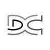
no font expert me, but that is not very Roman [as in Ancient]
doesn't make much sense in Latin either
ok maybe not much help, sorry... I'm inclined to think it was made from shapes, but then like I said, no font expert me...
 Member
It's not a font I can find. Often times, people will use Trajan Pro:
http://www.myfonts.com/fonts/adobe/trajan/
Schneidler Initials (which I have used several times):
http://www.myfonts.com/fonts/groupty...dler-initials/
Caslon Openface:
http://www.myfonts.com/fonts/bitstre...lon-open-face/
Etc.
Member
not bad - but not perfect for classical Roman; for example:
the capital P in Trajan has a gap which is not authentic - in Schneidler the swept tails for Q and R are not right, Q is close if a bit long and should be straight not curved, R is just wrong
 Super Moderator
The example davcoccio posted contained many characters that couldn't be read by sites such as IntelliFont or What the Font, so I separated the background out...and except for the live forum who might be able to help you at What The Font, the machine readers turned up nothing.
My first guess, like Mike's was that it might be similar to Trajon Pro or Trump Medieval Black.
Technically, It's a Roman font in today's descriptions, because it has thick and thin strokes. It's also a member of the Didot family because of the angle of the thin and thick strokes is almost perfectly vertical.
My guess is that someone either found a font they liked out there on places such as 101 fonts, that it's shareware, and you're never going to find it unless you can find the person who created the piece and ask them.
If you want a typeface that looks like it was carved in stone in ancient Greece or Rome, there's stuff like "Socrates", but it looks a little hokey and too thin, and "Lithos" is definitely Greek influenced, but probably not what you seek.
Take a look at how Tiffany Heavy, a little smushed, compares to your font sample. No, it's not perfect, but you could customize the glyphs in Xara. It has the Didot verticals, it has the triangle serifs, and it doesn't look new. :)
My Best,
Gary
Moderator Emeritus
Is it possible the font was hand lettered?
Great typographic insights OG.
Gary W. Priester
Mr. Moderator Emeritus Dude, Sir
gwpriester.com | eyetricks-3d-stereograms.com | eyeTricks on Facebook | eyeTricks on YouTube | eyeTricks on Instagram
Super Moderator
Thanks, OoG.Originally Posted by gwpriester

I think it has to be some ultra-obscure shareware or freeware typeface, because the glyphs are too consistent for someone hand-lettering the thing to previsualize an entire alphabet.
The main oddity that might make this sucker surface someday is that apparently the font (if it is a font) uses a "V" to express a "U", which you see a lot on carved stone text on millennia-old structures.
I hope dave can live with some of our recommendations!
OoOg
Member
the 'legs' on the K and the R different to either font
'thick and thin' may well be modern - the background image though points to antiquity
It's also a member of the Didot family because of the angle of the thin and thick strokes is almost perfectly vertical.
I don't know what you mean by this - do you mean the median intersection of the angle [on M and V say] is perpendicular to the baseline... or... ?
yes because latin script itself does not have a 'U', that came later, it only ever had a 'V'that apparently the font (if it is a font) uses a "V" to express a "U"
and 'K' was hardly ever used - Krizis is more Greek/eastern European than Roman
Super Moderator
"Didot" actually refers to Firmin Didot, the first typesetter to cut this sort of typeface. The primary characteristics of a Didot (modern name "Didone") class of font, and I'd like to thank John at Ilovetypography.com for this explanation, are:
1. A stress at 90° off the vertical. This is the way "stress" is measured. Anything other than perfectly vertical has some amount of stress the we call "diagonal".
2. Square or "stub" serifs, but very thin because of the stress angle. Rockwell and other square serif fonts have a more pronounced thickness in the serifs. The Mystery font here has triangular serifs, so it meets some but not all criteria here.
3. The Vertical axis. Didot class fonts are thinnest across the vertical.
4. "High Contrast" where curves meet stems. And this is why Didot fonts were at first fashionable, and then either modified or dumped. Bodoni is an excellent example of a vertically stressed typeface that is legible.
5. Small "aperture". Characters such as e, c, and a (lowercase) come very close to joining between the beginning and end of a curve segment.
There are degrees of stress in fonts we use every day.
...and this is why I cast this mystery font as a Didot-type face.
And this is also a post that belongs in a different section, but I'll leave it to the Moderators. :)
My Best,
Gary
 Posting Permissions

 Reply With Quote

Bookmarks