Very nice designs, Csehz, very professional, very inspiring and attention-getting!
Wesołych Świąt!
-g


 Super Moderator
Very nice designs, Csehz, very professional, very inspiring and attention-getting!
Wesołych Świąt!
-g
 Member
Gare your polish is perfect, Merry Christmas also for everyone
Super Moderator
@csehz
My capability to call my mother, her dad was Russian, and speaks a few Slovak languages, is perfect!
Gary
Member
A couple of nice pages from csehz. So although I did the Computer Zone advert, with help from Gary with my first attempt at this, I decided to see if I could do a clean no mess no bells, baubles and the like page. Not knowing much about Text alignment, Paragraph spacing what fonts to use etc. etc. I thought it was time I did a bit of self learning and I came up with the attached. It's nothing to write home about but I learned a lot from doing it.
Stygg
Super Moderator
That's a very neat, and very good "text heavy" page, stygg. I especially like that fact that you made the two columns different in width. When they are equal width, it looks like a tombstone and in the trade it's called that.
I think for printing, the green and blue you picked are fine because a straight conversion to CMYK would brute-force those colors into printing range of colors (gamut), which is different and smaller than RGB, and they'd be (unpredictably) duller and darker.
Interesting the discipline you put into it, stygg.
Much effort, much good!
-g
Member
Nice one Stygg, it reminds me to the Two columns web layouts in CSS with a content and an aside section
Member
Thanks for the feed back Gary, looking forward to more on this Page Layout and Design. I must admit and I don't know why? but I particularly like text pages, I think it's because they look so ordered and if done correctly (which I hope to achieve) can convey the content very interestingly and eye catching. The Pie Chart video is great, so got plenty to keep me busy with that and the Gold Star. Gary, your last sentence "Interesting the discipline you put into it, stygg". Not sure what you mean but I am a stickler (or boring) for order and alignment, not sure if that's a good thing or bad.
@ csehz, Thanks for the kind remarks, at least I got something almost right for once
Stygg
Super Moderator
@ stygg
I simply meant that you were very focused, no screwing around, when you set out to do a text-predominant page, you didn't post until you and the world knew it was a winner.
Sometimes you trust your gut. Spielberg did for decades with his films. He knew he was gifted and he told people, "I made movies that I myself would be interested in seeing."
So if you trust your gut, and you can wink in the bathroom mirror in the morning and say, "Damn, you're good!", and do it with conviction...you got a winning attitude and a winning recipe.
Apologies in advance if my posts are more "organic" than they are strict, empirical menu commands and stuff.
I'm pre-occupied with bringing the Holidays to tg!
-g
Member
Thanks for the reply Gary "I simply meant that you were very focused, no screwing around, when you set out to do a text-predominant page, you didn't post until you and the world knew it was a winner" That is exactly what I did Gary and I was quite pleased with myself
Stygg
 Member
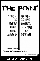
Was playing around during half time of the football game I was watching.
Take care, Mike
 Posting Permissions


 Reply With Quote

Bookmarks