Welcome to TalkGraphics.com
Page 3 of 10 FirstFirst 12345 ... LastLast
Results 21 to 30 of 94
  1. #21
    Join Date
    Oct 2002
    Location
    Liverpool, N.Y.
    Posts
    6,085

    Default Re: November 2013 Xara Xone Tute: Page Design Part One

    Stygg, you did great for two ambitious page designs.

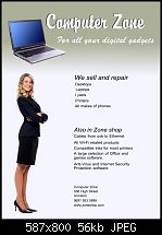
    Computer Zone (if you're open to constructive criticism) is that you should weight your text differently, perhaps different alignment, definitely a more interesting but professional typeface, and do me a favor here—look at the above ad and tell me if you don't feel there's too much "air" on the left and the right of the text. Here:

    Click image for larger version. 

Name:	Layout.jpg 
Views:	241 
Size:	56.4 KB 
ID:	99756 Click image for larger version. 

Name:	Bouton defaces stygg's work.jpg 
Views:	250 
Size:	60.3 KB 
ID:	99754

    My modification of your ad is very "font aware". I used the heaviness and the size of the text to make the points in a way that draws your eye to what's important in the advert.

    This indeed does stick the the grid system, it's just that I didn't fill all the cells, but I think you can see the structure here.

    You didn't do anything wrong, mete: I just haven't presented the "Typography" episode yet! Body text has form and shape in addition to the printed message. I'd love to see someone, right now, do an all text ad, and use fonts and font locations and sizes to create motion and graphical substance.

    Also, and this is a new one to me, that stock photography, at least on the Web, is ineffective. A real person, or a celebrity, people stop to register, so I think the lesson here is that you can't use stock photography in a gratuitous way to fill up the page, or use someone handsome or sexy to sell your product. The generation of the most heavy consuming people are Generation X and not us Boomers, and they are wise and immune to trying to sell a product with unrelated material.

    Your second ad, stygg, is a beautiful accomplishment in black and white. I like the staggered elements and don't mind the somewhat obvious two column treatment at all.

    Two column layouts need special care to disguise the grid. They are called "tombstone layouts" (because that's the way a lot of grave markers are made); three columns, or four, or even two uneven columns are good to try out for text-intensive page design.

    My Best,

    Gare
    Attached Files Attached Files

  2. #22
    Join Date
    Jan 2006
    Location
    Urmston, Manchester,England
    Posts
    2,527

    Default Re: November 2013 Xara Xone Tute: Page Design Part One

    Thanks Gary for such excellent feedback, that is just what I wanted to achieve but didn't know how to go about it, that is one to keep in my files. The woman is from the clip art in P&GD7 as is the laptop. What a difference correct layout makes with the right fonts, size and spacing. Looking forward to more from you on design next year, I'll have upgraded to P&GD9 or Pro9 by then

    Regards Stygg

  3. #23
    Join Date
    Oct 2002
    Location
    Liverpool, N.Y.
    Posts
    6,085

    Default Re: November 2013 Xara Xone Tute: Page Design Part One

    You're welcome and a good sport for not slapping me for re-doing your ad!

    I guess typography, which fonts to choose AND how to stack and align them, deserves an episode in The Page Design Saga.

    Truthfully, I came from a background where we'd order text that was rendered optically (photographically, sort of), it came on pages or strips, we'd photocopy them because they were expensive, and we'd cut them up and use rubber cement to tack down text block until we thought they'd make a good ad.

    But we all have sort of the same thing: you can scale text (which we couldn't do easily or quickly in the late 1960s), rotate, distort...the possibilities are immense.

    It helps to zoom out before you think you're done to see "the color" of the page...where dense areas are, where light ones are, and that they are correct and in the position the deserves attention, or not.

    My Best,

    Gary

  4. #24

    Default Re: November 2013 Xara Xone Tute: Page Design Part One

    Quote Originally Posted by Gare View Post
    ...right now, do an all text ad, and use fonts and font locations and sizes to create motion and graphical substance...
    Just couldn't do an all text ad. Not creative enough. My main excuse is I had enough time to squeeze this in for tonight. Got payin' work to do.

    A little clip clip here, clip clip there using the Pacific rim and color the body several shades different than the countries' outlines around the edge of the magazine display ad (looked up a travel mag's advertising specs for a 1/3 page horizontal ad) and I would like it better...

    Mike

    Click image for larger version. 

Name:	travel.png 
Views:	252 
Size:	90.8 KB 
ID:	99765

  5. #25
    Join Date
    Oct 2002
    Location
    Liverpool, N.Y.
    Posts
    6,085

    Default Re: November 2013 Xara Xone Tute: Page Design Part One

    Hey, Big Fellah—

    Thanks for posting, but Mike? This is not a time-sensitive tutorial, and certainly I'm not pushing anyone when they have friends and family to be with around this time of year.

    What you did wasn't what I'd anticipated, but it's clean and looks good for commercial printing (ewww, all the trapping with light text on a dark background!)


    -g

  6. #26

    Default Re: November 2013 Xara Xone Tute: Page Design Part One

    Oh...no imposed time constraints from your end. My end. Got a 1.7 gig zip file from someone yesterday. That's my time constraint.

    The colored text will be fine. At 10 point, using a tint of the background color using offset as does the magazine, it will be more than clear enough.

  7. #27
    Join Date
    Jan 2006
    Location
    Urmston, Manchester,England
    Posts
    2,527

    Default Re: November 2013 Xara Xone Tute: Page Design Part One

    Gary just a question with regard to your last sentence in #25 In the upcoming tuts on Page Design, will you be touching on commercial printing and personal ? I'm not well up on all this Design Layout and would have no idea on what size's to use say for a web page or an advert in a web page, posters etc. The design you corrected for me, thankfully, in #21 would be considered an advert or a poster,commercial or personal printing? This is where the confusion sets in with me.
    Please forgive my ignorance on all these topics. I've only ever made a couple of posters for some local shops at A4 and US letter size and printed them out in PDF format, so my expertize is lacking sadly I'm sorry to say, but if your video's next year will be touching on some of these points, I will be a happy fella

    Stygg

  8. #28
    Join Date
    Oct 2002
    Location
    Liverpool, N.Y.
    Posts
    6,085

    Default Re: November 2013 Xara Xone Tute: Page Design Part One

    I'm a lightweight when it comes to printing, stygg. I've not kept very current nor very "deep" into the subject. My background was television, with only a smattering of print when I worked in advertising.

    I can give you a little advice on prepping your work for commercial versus personal printing, but that is not my goal for 2014 and this "series".

    I want next year to show people how to design pages better. We all focus on illustration work, but that's not always the end goal. How do you complement and reinforce an illustration withe text? What sort of typography is best, and for what?

    The tutorials will be design-based, with advice on Xara's features.

    There are folks I'm sure who would step forward and give you commercial printing advice that's up to date if you ask at tg.

    My Best,

    Gary

  9. #29
    Join Date
    Dec 2007
    Location
    Sunshine Coast BC, Canada. In a beautiful part of BC's temperate rainforest
    Posts
    9,864

    Default Re: November 2013 Xara Xone Tute: Page Design Part One

    I think that Gary gave some good advice in the video: Talk to your printer I've use a few different printers locally over the years and depending on their equipment they can have differing requirements regarding things like bleed etc.
    [SIGPIC][/SIGPIC]
    My current Xara software: Designer Pro 365 12.6

    Good Morning Sunshine.ca | Good Morning Sunshine Online(a weekly humorous publication created with XDP and exported as a web document) | Angelize Online resource shop | My Video Tutorials | My DropBox |
    Autocorrect: It can be your worst enema.

  10. #30
    Join Date
    Apr 2011
    Location
    Hungary, Poland
    Posts
    1,265

    Default Re: November 2013 Xara Xone Tute: Page Design Part One

    I would like just also say thanks for the tutorial, did some tries but which are rather just plays. Always wanted to see once how to repel text inside a shape for example, and this tutorial just reminded me. So not three columns like of design, the third one is I know absolutely abstract

    Click image for larger version. 

Name:	Time_for_Skiing1.jpg 
Views:	229 
Size:	82.8 KB 
ID:	99839Click image for larger version. 

Name:	Time_for_Skiing2.jpg 
Views:	220 
Size:	87.1 KB 
ID:	99840Click image for larger version. 

Name:	Time_for_Skiing3.jpg 
Views:	226 
Size:	48.8 KB 
ID:	99841

    Time for Skiing_tries.xar


Bookmarks

Posting Permissions

  • You may not post new threads
  • You may not post replies
  • You may not post attachments
  • You may not edit your posts
  •