Not that I would layout a book in XDP, but I might use it to quickly play with an overall theme or design...And I would certainly use it for graphic elements.


 Member
Not that I would layout a book in XDP, but I might use it to quickly play with an overall theme or design...And I would certainly use it for graphic elements.
 Super Moderator
The series I began last month isn't about Desktop Publishing, because 1.) Desktop Publishing today is largely creating a template, dumping text from MS-Word into the template, and then placing images in-between paragraphs, or however the template dictates the positioning of the graphical elements.
And that is stultifying (see also boring, mind-numbing, minimum wage, third world).
And using Xara Designer for DTP is an example of the wrong tool for a specific job. If you did even an average chapter from a book in Xara, you'd soon get a system slowdown because images are actually placed in the document instead of being linked as Adobe InDesign and Quack Xpress do. Think of taking a complex illustration in Xara and extruding it—same sort of strain on the display engine.
What I'll go on and on about (!) next year is page layout; yes, you can do an 8-pager in Xara exceptionally well, perhaps even a few more, folio-style, but again, page layout is a building block of DTP...I fail to see how not learning how page elements work in concert would make you a pro designing an actual dtp template.
I've been using Xara for almost ten years, composing 8 page color sections for books, and the production department has absolutely no problem with them, be they TIFF images they super text upon, or EPS graphics, so perhaps I'll offer an aside here and there concerning "size", but it's a technical issue and not a creative one.
Mike, several members have commented on "The Point", how visually exciting it is.
It's because the page is laid out creatively, right?
I'd love to have taught that page, how your visual "hook" serves as a column divider. How you used white space in the 3/4 space in an imaginary grid to push the viewer's eye up to the headline.
Even if you weren't consciously aware of the "rules" you were following in the piece, clearly you have an innate understanding that you follow as a creative person.
I hope everyone had a pleasant Christmas, the stress is gone now, and you still have some of those cookies left in the kitchen.
That tin looked LARGE!
My Best,
Gary
Member
I only did a book page to make a point from elsewhere
Re, The Point. I had more text originally. I took everything away I could until it made the point without the extraneous verbiage. I like retro design, I like retro typefaces. The execution only took a few minutes. The gestation period had been a couple weeks. There are still more rattling around the noggin.
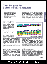
Now, this is the type of thing I have used XDP for. An 8 page menu served up...this being a mock-up. Cover and an interior spread.
These will be my last contribution (probably). I feel like I am the Lone Ranger. Someone, anyone, please post some samples and save y'all from me.
Super Moderator
You're not A Lone, Mike; sensible people (IOW those not online during the Xmas/New Year "hammock") haven't hit this thread yet. But clearly, this topic is getting a lot of hits, so we'll be patient and I'll post and image soon and ask someone to work it into a page layout, what say?
My Best,
Gary
 Member
Good page layout isn't just for DTP, it's important for website design too. I've got a web design job I'm starting in a couple of days and I will be using a grid based layout. When I get a chance I'll post a screen shot or two.
[SIGPIC][/SIGPIC]
My current Xara software: Designer Pro 365 12.6
Good Morning Sunshine.ca | Good Morning Sunshine Online(a weekly humorous publication created with XDP and exported as a web document) | Angelize Online resource shop | My Video Tutorials | My DropBox |
Autocorrect: It can be your worst enema.
Super Moderator
Ack!
I'm trying to confine all this page layout jazz to the printed page!
Yep, you're absolutely correct, though, Frances: a good layout is portable, as are the disciplines.
-g
Super Moderator
How about this for an assignment/challenge?
Here's a picture; let's pretend it's a full page ad or article in a Conde Nast publication.
Where would you put the headline? Where would you put the body copy? How many columns? What font would you choose for the headline and the text?
There's no "right" answer here.
I'm just interested after watching the video how members woulds arrange the layout, now that the image is a given.
Attached is a large JPEG for Xara.
-g
 Posting Permissions

 Reply With Quote


Bookmarks