Welcome to TalkGraphics.com
Page 2 of 2 FirstFirst 12
Results 11 to 18 of 18
  1. #11
    Join Date
    Apr 2011
    Location
    Hungary, Poland
    Posts
    1,265

    Default Re: Metallic Text Challenge

    Quote Originally Posted by gwpriester View Post
    From my July 2005 Xara Xone tutorial http://www.xaraxone.com/tutorials/jul05/index.html
    Gary that is so great looking, thanks for reminding the link

  2. #12
    Join Date
    Mar 2007
    Location
    ...Granada province, Andalucia, Spain
    Posts
    5,302

    Default Re: Metallic Text Challenge

    Here's my attempt, using a prismatic font, that comes in three parts, so that different fills can be applied to each.
    Bob.
    Attached Thumbnails Attached Thumbnails Click image for larger version. 

Name:	chrome.png 
Views:	154 
Size:	64.8 KB 
ID:	99825  
    ** Detailed "Create A Spinning Logo Tutorial" is available in .pdf format for download at this link **
    Outside of a dog, a book is a man's best friend. Inside of a dog, it's too dark to read. Groucho Marx.

  3. #13

    Default Re: Metallic Text Challenge

    Here is mine.
    Attached Thumbnails Attached Thumbnails Click image for larger version. 

Name:	metallic.jpg 
Views:	147 
Size:	114.3 KB 
ID:	99832  

  4. #14
    Join Date
    Oct 2006
    Location
    StPeters, MO USA
    Posts
    10,819

    Default Re: Metallic Text Challenge

    Click image for larger version. 

Name:	TG metal.jpg 
Views:	147 
Size:	16.1 KB 
ID:	99833
    Larry a.k.a wizard509

    Never give up. You will never fail, but you may find a lot of ways that don't work.

  5. #15
    Join Date
    Nov 2012
    Location
    Manchester, UK
    Posts
    414

    Default Re: Metallic Text Challenge

    I posted one of my contributions on a couple of other forums and somebody on the other forum posted it on a phot/image sharing site.
    This thread brings up another question, is text art better off done in portrait or landscape page settings? I always use landscape setting my self as it leaves more room for added effects.
    BTW It was the word art on MSWORD8 that got me started and it finally led me to this. I've also found that adding a metallic effect to black makes it look more polished if 3d's added.

  6. #16
    Join Date
    Sep 2005
    Location
    London, England
    Posts
    520

    Default Re: Metallic Text Challenge

    Click image for larger version. 

Name:	chrome.jpg 
Views:	154 
Size:	20.5 KB 
ID:	99835

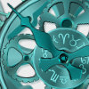
    I tend to do chrome effects quite a lot. This uses the Chrome plug-in that sadly is no longer bundled with Xara.

  7. #17

    Default Re: Metallic Text Challenge

    Another one.
    Attached Thumbnails Attached Thumbnails Click image for larger version. 

Name:	m.jpg 
Views:	152 
Size:	18.5 KB 
ID:	99860  

  8. #18
    Join Date
    Sep 2005
    Location
    London, England
    Posts
    520

    Default Re: Metallic Text Challenge

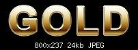
    I've finally managed to get a gold effect that I'm satisfied with. For years I've been trying to get a realistic fade that would depict metallic gold. This is the closest I've ever got. Mind you, always a work in progress...

    Click image for larger version. 

Name:	gold.jpg 
Views:	169 
Size:	23.5 KB 
ID:	100217


Bookmarks

Posting Permissions

  • You may not post new threads
  • You may not post replies
  • You may not post attachments
  • You may not edit your posts
  •