Like the style of the brave, nimrodor.
Paul, everyone knows the greatest game on earth is hockey.


 Member
Like the style of the brave, nimrodor.
Paul, everyone knows the greatest game on earth is hockey.
Member
How about this any better?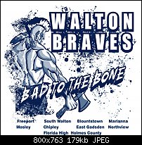
 Moderator Posthumous
Maybe is some ways. I do not like the dark square in the lower left corner though. That square might be OK except the far left side doesn't seem to work.
Larry a.k.a wizard509
Never give up. You will never fail, but you may find a lot of ways that don't work.
Member
Thank you for the help wizard509 I change it a little more and add the color of the shirt that it's going on.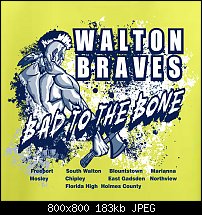
 Member
Looks excellent now I think they will love it.
You can take a horse to water, but a pencil must be lead!
 Member
This is out of my comfort area, but some things strike me as problematic.
The dark bits exploding make 'Bad to the bone' harder to read because they are the same colour as the text outline/3D. 'Bad to the bone' almost merges with the figure where it's in front of it (specifically the dark of the text extrusion, and between O and T where there seems to be a superfluous dark stroke).
The position of the placenames seems a bit random and they should either line up, or definitely not line up, but not look as though they should line up but don't (the second row of placenames look like they should all be nudged a few pixels right).
The dot over the P in Freeport needs to be moved to make the text clearer, or move down Freeport and Mosley to escape the background interference.
Member
Thanks pauland I had the names lined up but they must of got out of wack anyway I see what you mean on bad to the bone so I outlined it I think this should be pretty good.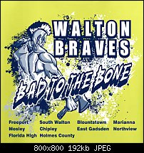
Member
I like that much better. The text now stands out.
I'd suggest that you move Florida High and Holmes County one place to the right, and then Freeport and Moseley down one row - they will then clear the illustration.
Good job!
Moderator Posthumous
Much better, but I'm not crazy about your choice of a background color. To me it just doesn't work well. I'm not saying these two are the answer but you might look at dfd890 and c8c6ae and see what you think.
Larry a.k.a wizard509
Never give up. You will never fail, but you may find a lot of ways that don't work.
Member
The color is going to be a safety green t-shirt, the customer wants a neon color for neon night at the school. The only choice in bright colors was green, orange and pink orange was another teams color and pink was to gender based they felt so they went with green. I like the pink I printed navy on pink before but not my choice to make. Thanks anyway if I could I go with something else.

 Reply With Quote

Bookmarks