Yes, I agree, the blue is too dark and yes- changing colours is easy. I just hadn't bothered as I was working on getting the whole thing running.

 Member
Yes, I agree, the blue is too dark and yes- changing colours is easy. I just hadn't bothered as I was working on getting the whole thing running.

 Super Moderator
Good, thanks Grace.
Please bear in mind that when you make a presentation, you need to cater to those of us who are ignorant about coding, and also what a "finished version" looks like.
When I worked as an art director at an ad agency, we were always careful to keep stuff we'd show to the cloejt rough and sketchy. Because when a print ad looked too polished, the client presumed it was the finished ad.
Of course, I'm brighter than that. *< 8 O ) <---clown smiley
-g
 Moderator Posthumous
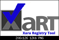
I totally agree with Gare about the blue. Another thing I noticed that bothers me is the dark brown background on the Xart logo, it is too close in value to the blue check mark and the check mark gets almost lost as a result.
Larry a.k.a wizard509
Never give up. You will never fail, but you may find a lot of ways that don't work.
Member
OK currently the blue is gradient starting at #FF3AABF9 and ending with #FF4249F5. What would you like them changed to as this seems to be a hang up on answering my actual question. Also, here is the logo to play with. I don't have the Xar file.
Moderator Posthumous
Grace,
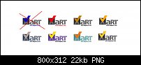
Here are some of my color experiments. They are down and dirty so just view with a grain of salt. The two largest are similar to what you have except for the check mark.
I have not yet reached any conclusions. But I do have my favorites.
Larry a.k.a wizard509
Never give up. You will never fail, but you may find a lot of ways that don't work.
 Member
Originally Posted by gracehjs

I tried to put a few things together and present an alternative to the blue interface and logo. I only prepared half of it because that should give a good enough impression of what is possible.
Member
When I replied yesterday half of what I wrote got lost. I said that I really liked your ideas and would it be possible to have .XAR file with the buttons.
Thanks
Member
I attached the .xar file for the above interface mock-up. Sorry that the file is a bit messy because I put it together as I went along.
Super Moderator
The logo is attached here as vector art, and I used one of Larry's color schemes. Thanks to Mind's Eye for the treatment of the "art" portion, and I believe the subordinate text is Adobe Myriad Condensed Bold (or Black).
-g
Moderator Posthumous
If you like when I get home I will put together vector version.
Larry a.k.a wizard509
Never give up. You will never fail, but you may find a lot of ways that don't work.
 Posting Permissions


Bookmarks