I don't think that you can come up with a colour combination that is going to please everyone, for instance I don't like Rik's dark combo with the flouresent green. I also think that a harmonious colour scheme is the way to go.


 Member
I don't think that you can come up with a colour combination that is going to please everyone, for instance I don't like Rik's dark combo with the flouresent green. I also think that a harmonious colour scheme is the way to go.
[SIGPIC][/SIGPIC]
My current Xara software: Designer Pro 365 12.6
Good Morning Sunshine.ca | Good Morning Sunshine Online(a weekly humorous publication created with XDP and exported as a web document) | Angelize Online resource shop | My Video Tutorials | My DropBox |
Autocorrect: It can be your worst enema.

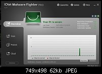
I Don't see any fluorescent green in Rik's dark UI.Originally Posted by angelize

I like the type of UI that IObit use, Rik's is kind of similar
Member
Not the nice Dark UI but one he posted before that. I'm just playing with different colour combinations I don't have a .xar file for Rik's Dark UI so I am just using a quick mock up to show how the harmonious colours look together. Grace indicated that she prefered red in the logo so I settled on a nice shade of red and the rest of the harmonious colours are based off of that.
Here is another one
[SIGPIC][/SIGPIC]
My current Xara software: Designer Pro 365 12.6
Good Morning Sunshine.ca | Good Morning Sunshine Online(a weekly humorous publication created with XDP and exported as a web document) | Angelize Online resource shop | My Video Tutorials | My DropBox |
Autocorrect: It can be your worst enema.
 Super Moderator
Do we know or have we decided what colour scheme we want?
Featured Artist on Xara Xone . May 2011
. A Shield . My First Tutorial
. Bottle Cap . My Second Tutorial on Xara Xone
 Member
Frances, the opposite of active is inactive.
Member
I think it is still a work in progress. Eric is going to start "coding" the UI and will look at skinning.
 Super Moderator
My 2 ¢ on a color theme and scheme:
As far as "dark" UIs go, there has been only one, perhaps two that have struck me as functional, not too much or too little contrast, and actually sort of attractive.
Here's a screen cap of I believe four colors used in Luxology modo's interface, a popular modeling program:
It's interesting and relevant to our discussion here that because we have 16.7 million unique colors to play with, even the slightest variation on a shade or a tone can be a deal-breaker. I think Frances' scheme is worth another look because she's close (IMHO) but not spot-on. That warm sand colour could be more neutral, less saturation.
And I think more than one person has told The Xara Group that the Dark UI produces headaches and it's a matter of degrees. If they'd lighten it even 5%, it would make a world of difference in terms of usability.
Grace, if you programmers are almost at the point where you can hook a front end up, I heartily endorse a very critical look at what you have right now and where you need to go with the UI, because we're going to have to live with it for a while, yes?
My Best,
Gary
Member
Lots of good ideas...
Been away from the computer for a few days, but here's a sample layout I came up with using an off-red that plays off Rik's original blue design. It has a UI more friendly to tablet/phones perhaps, although the target platform will be desktops in most cases. The vertical scrollbar would allow for a long list of options, with the active option being highlighted and its long description / help displayed. "Undo" and "Set to Default" buttons apply to the selected option. Maybe someone has a better idea than the "Home" button for that.
Didn't try to exactly duplicate Rik's logo, which I like. This is more to generate color and layout ideas. As far as I know, Grace hasn't selected anything yet, but could be wrong.
 Posting Permissions


Bookmarks