very nice Stygg, I can tell you have been enjoying this


 Member
very nice Stygg, I can tell you have been enjoying this
[SIGPIC][/SIGPIC]
My current Xara software: Designer Pro 365 12.6
Good Morning Sunshine.ca | Good Morning Sunshine Online(a weekly humorous publication created with XDP and exported as a web document) | Angelize Online resource shop | My Video Tutorials | My DropBox |
Autocorrect: It can be your worst enema.
Member
I have FrancisOriginally Posted by angelize

Stygg
 Super Moderator
@ stygg and everyone
I created a font I consider a "logo starter kit". You type a gylph, add some text, you have a logo. At least a beginner's one!
Why not get some brushed aluminum, or some wood, and have a go at texturizing these logos?
It doesn't have to be a book this month! Get comfortable with making pressed lettering and symbols look photorealistic!
-g
Super Moderator
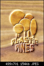
Something like this, for a LEGO family looking for a starter home?
Member
I had a look at the font, thanks for sharing with us Gary. Here is a pizza place logo done in sausage on a gooey carmelized cheesy background! The background image is a seamless procedural texture and the sausage texture I found on a free texture/stock photo site called Image After.
[SIGPIC][/SIGPIC]
My current Xara software: Designer Pro 365 12.6
Good Morning Sunshine.ca | Good Morning Sunshine Online(a weekly humorous publication created with XDP and exported as a web document) | Angelize Online resource shop | My Video Tutorials | My DropBox |
Autocorrect: It can be your worst enema.
Super Moderator
@Frances, and actually for everyonea little mini-lesson in logo design:
Although in theory the pizza image outside of the logo and sausage texture inside is inspired and inventive, I don't feel it works.
The brownish red predominant hue is too similar
The pizza slice artwork is supposed to be a "hi-con" (high contrast) photo, and as such it's dimensiuonal and has drop-outs to suggest shapes through negative space. This makes the piece not ideal for filling with a complex texture. The overall look becomes disorienting and a logo should be clever but forthright.
So my bad for telling anyone that all the logos in this font would be good to use.
However, I like the idea of a fictitious pizza parlor (that isn't Dominoes), and I believe if we re-think, simplify, and leave ourselves open to interpretation and revisions, there is some fun to be had here. Bear with my train of thought:
Here's a very different treatment of your logo, Frances. The slices suggest, but do not depict, toppings. It's very stylized but recognizable as four slices of pizza. I ran some sans serif, narrow text around the top sort of like how a dealer's felt looks at a casino, the pizza slices might be thought of as playing cards dealt out (I know this is a stretch, okay?). Finally, I used a typeface called Elephant Italic to contrast against the tall skinny text, and it also looks a little Italian in its design. The Xara file is attached.
So I looked around for a pizza background on the web, and bleached the daylights out of it so any lines in the photo wouldn't compete with the logo.
Usually, green is not an attractive color for food, but pizza is an exception. I decided on a glossy solid color fill for this version to try to emphasize "cheese". Finally, I got desperate that the logo wasn't separating well enough against the visually busy pizza photo, so I spread a dark brown drop shadow beneath the text. It's not a great treatment of the logo, but then again, a good logo should be able to stand on its own without embellishments, and I believe the white on maroon original does that.
Okay, version 2:
I like this one a lot; I did three different bevels, each a different color, and the centre appears to have a slight highlight on it.
Version 3 harkens from the K.I.S.S. Schooljust use a solid color that contrasts against the photo. I used a slight drop-shadow to help separate the brightnesses in the pizza photo from the white of the text.
And version 4 does indeed use an interior and an exterior texture, but ya gotta find ones that are appropriate and...work!
This is not my favorite version, not if I was trying to sell it to the client. It's too busy visually, I had to cheat and outline the logo, it's very very "busy" at the expense of visual communication....but I'll betcha someone in our community could make this work swimmingly.
I'm tapped!
My Best,
Gary
Super Moderator
I like this one, stygg!
-g
Member
I tried a different way to go about a this. I agree that my original was not working. In this one I used the pizza slice in a different way. I created my sausage which is just an ellipse filled with the sausage texture I used before and used the bevel technique to make it appear pressed into the cheese and even used the eraser to make it look like the sausage is under the cheese a bit on one side. I used the bevel technique on the logo to make it appear to be seared into the sausage (this took a filter forge noise distortion, a fractal plasma transparency and and embossing effect as well as the bevel.
I also adjusted the hue in my cheesy texture so the sausage stands out better.
[SIGPIC][/SIGPIC]
My current Xara software: Designer Pro 365 12.6
Good Morning Sunshine.ca | Good Morning Sunshine Online(a weekly humorous publication created with XDP and exported as a web document) | Angelize Online resource shop | My Video Tutorials | My DropBox |
Autocorrect: It can be your worst enema.
Super Moderator
Angelize, first and foremost, please understand that I'm not picking on you, okay?
My criticism is meant to be constructive, and actually the definition of "criticism" is not "to bash"....it's
"The honest evaluation or appraisal of a work or body of work."
Your revised design passes the legibility and contrast test.
But it fails to be appealing, I think.
Yes, it quite looks like what Barbara and I get in a box delivered to our door, but we're hungry, our sense of smell tells us it'll be great to eat, and it's warm (usually), and these other sensory distractions take our minds off what a pizza sometimes can look like: at it's worst, it's cooked meat slurry, an uneven shade of brown for the crust, and little bits of things scattered around it.
This is why advertising agencies spend big bucks on food stylists, professionals who know how to prepare food not so it tastes good, but so it photographs in an appetizing way.
I think you might be on to something with the logo branded into a slice of pepperoni...as a design element. But as the whole piece is presented, I'm going to go to Pizza Hut and not Blackjack's.
And I'm not being snarky here.
Give me a graphical reason why I'd choose Blackjack's Pizza over the competition. Not a slogan, a visual reason.
I know this is getting into logo design which is a little O/T, but color and texture and logos are inextricably linked in business graphics today.
Give it a thought, Frances?
My Best,
Gary
Member
I know this is going in a completely different direction but I came across a lovely orange leather texture last night and it made think of handbags, and inspiration struck. So I took a whirl at using the tutorial methods along with some Eye Candy chrome metal effects to create my own designer label.
[SIGPIC][/SIGPIC]
My current Xara software: Designer Pro 365 12.6
Good Morning Sunshine.ca | Good Morning Sunshine Online(a weekly humorous publication created with XDP and exported as a web document) | Angelize Online resource shop | My Video Tutorials | My DropBox |
Autocorrect: It can be your worst enema.
 Posting Permissions

 Reply With Quote


Bookmarks