I see. Hadn't noticed that image. But the cube as registry concept actually comes from MS RegEdit.Originally Posted by Gare


 Member
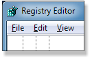
I see. Hadn't noticed that image. But the cube as registry concept actually comes from MS RegEdit.

 Super Moderator
To paraphrase Albert Einstein, Originality is directly proportional to your success in hiding your source.
It doesnt bother me in the least that XaRegs graphic there looks like a modified Windows RegEdit icon. Its appropriate, I do wish Id thought of doing this clever variation first (!), but when all said and done, Microsoft cant really take the credit for originality because the RegEdit icon looks almost exactly like a Rubiks cube, a puzzle, much like the Registry.
Im much happier and would be much more content if we walked away from this similarity and take stock of what some of the artists on this thread have submitted. Im partial to the checkmark in a box, with it being part of a larger X. It will reproduce well at icon size, and at least three of us worked on it, so its a fitting tribute to community collaboration, open source precepts, and originality.
There will be no 100% departure from the original concept of this applet: that was undeniably Steve and Bills doing. But we can at least redefine what this program is a little by branding it with an original icon.
-g
Member
I agree, I thought we had pretty much decided on the logo/icon. Of course, we can be fickle
Last edited by gracehjs; 13 June 2013 at 05:59 PM. Reason: typo
 Super Moderator
I like that one.
Featured Artist on Xara Xone . May 2011
. A Shield . My First Tutorial
. Bottle Cap . My Second Tutorial on Xara Xone
Super Moderator
@Grace
I, probably for one (!), believe we need a combination headmaster/air traffic controller for this project, because the threads turn to anarchy and entropy every third post as not everyone bothers to track the history of the thread and look at examples, right and wrong ones.
So I'd leave it up to you and Steve, because we're only putting the makeup on the model: you two are creating it.
@Rik
I'm not 100% happy with the one I did in post #92, but thanks, Rik.
I'm sure you, mindseye, and other clever designers here can bring it to the finish line, Grace will like it, and then we can close the book on that particular element.
This could go on forever. But it shouldn't.
And I'm sorry but I have an obsessive fixation of using 80% black with orange as a highlight, because it visually says "today", and it has really good contrast without causing headaches and eye strain.
Attached.
 Posting Permissions


Bookmarks