@Beanpole—Problem #1 is making it hard to discern the solution to Problem #2. I really can't see if there is enough color contrast, because of all the leaves in front of the characters.
I really don't want to discourage anyone from experimenting and I do see improvement, but if everyone would please consider this:
If you've posted more than 3 cracks at a composition, and the current one is better in one area, but worse in another...the problem is with your "process".
IOW, your game plan going in isn't sound. And you're patching your original idea and diluting it, because you didn't work from the General to the specific.
Example? BeanPole, would you mind? Me, I'd have started with an outline drawing with white fill for everything, to see how the composition looks in general. Then, with great deliberation, I'd start mixing up textures, fractals, gradients, and other fills, comparing one to another to see how they balance and influence the overall graphical idea.
If this sounds like the long way about things, look at the time you've invested so far.
And I'm singling BeanPole out here for criticism. This is just advice and you can then choose to ignore me in a minute or two.
Sadly, computer graphics programs offer this enticing thing called "instant accomplishment". There is no pencil sketch, you go straight from idea to finished drawing.
Or do you?
Let me introduce a different fill type here; fractal fills are okay, but they cannot represent everything because there are only two types of fractals. Open the Fill Gallery, and if it's not populated, download some of the fills from Xara's server.
There's gotta be a bitmap in the Fill gallery that does a better representation of bare earth than trying to use a fractal fill.
I've attached a piece that has a "grass" brush in it. I encourage anyone here to take apart this drawing. It's a little bit of this and a little bit of that—an extrude, a brush, some gradient fills, and fractal transparency.
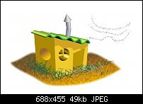
But I believe the piece succeeds because I had an idea of how it should look before I began it. Then, and only then did I decide on what features to use and I built the piece a little at a time, checking for artistic balance, color coordination, editing the grass color so it has contrast in both light and dark grounds...basically sweating the small stuff all along the process.
-g


 Reply With Quote


 I am going to download Gare's example and I too am going to take the night off.


Bookmarks