Thanks Everyone! And Thanks Barbara for posting this up.


 Member
Thanks Everyone! And Thanks Barbara for posting this up.
[SIGPIC][/SIGPIC]
My current Xara software: Designer Pro 365 12.6
Good Morning Sunshine.ca | Good Morning Sunshine Online(a weekly humorous publication created with XDP and exported as a web document) | Angelize Online resource shop | My Video Tutorials | My DropBox |
Autocorrect: It can be your worst enema.
Member
Here is something I've been experimenting with. Roundhead is a wonderful font to play around with the mold tool!

[SIGPIC][/SIGPIC]
My current Xara software: Designer Pro 365 12.6
Good Morning Sunshine.ca | Good Morning Sunshine Online(a weekly humorous publication created with XDP and exported as a web document) | Angelize Online resource shop | My Video Tutorials | My DropBox |
Autocorrect: It can be your worst enema.
 Moderator Posthumous
Thanks one and all!
Soquili
a.k.a. Bill Taylor
Bill is no longer with us. He died on 10 Dec 2012. We remember him always.
My TG Album
Last XaReg update
Moderator Posthumous
Thanks everyone.
Soquili
a.k.a. Bill Taylor
Bill is no longer with us. He died on 10 Dec 2012. We remember him always.
My TG Album
Last XaReg update
 Member
thanks everyone
-------------------------------
Nothing lasts forever...
 Member
Thank you very much for this generous gift, Font and Typography Group!
As I didn't really understand the difference between .otf and .ttf fonts I was researching the web and playing with the two versions in my font manager. I assume that both versions should should render identically but I noticed that in some text examples some of the characters seemed to shift.
To see what was going on I put two identical texts on top of each other in XDP7 and indeed noticed here and there a horizontal shift. I could easily neutralize these shifts by adjusting the kerning but I wonder if this behavior is to be expected or if this is a bug (if that is the right word for a font).
Examples of shifts I noticed are between the 'e' and 'p', the 'a' and 'b' and, especially, the 'r' and ','.
I apologize if I am raising a non-issue...
 Super Moderator
Hi Boy—
I'm responsible (or irresponsible) for the last pass at coding this group font. If you'd be good enough to do a screen capture and post it or attach it here, I'd love to see what the problem is. Now, the caps and the lowercases do have different baselines, however, there should be a consistency between character height and if there isn't, we're going to take this sucker back to the shop for more work.
Specifically, if you're saying that the TTF and the OTF versions aren't absolutely identical, then there is no alarm.
First, no one is going to use both versions at the same time, or shouldn't or they might be bored. We offer both formats because OTF is becoming the preferred font format—TrueType is an older technology, and some would tell you that the math beneath Trutype is unnecessarily "verbose", and the file sizes are larger than they could be.
Now, I might have done something, but I don't think so; at the last moment, the Administrator realized there was no OTF version in the zip archive, only the TTF. So I did a version lickety-split, but perhaps my lickety was not calibrated last night.
OpenType is a different technology than Truetype, Boy. Adobe and Microsoft worked on it together, and TrueType was a product of Apple and Microsoft. But the relationships only govern the engineers who worked on the technology; it's not political, not a concern to users. Truetype uses Quadratic b-splines to create outline: two control points on the curve, two control points off the curve. Opentype, in addition to being a technology, is also a "coding wrapper"—TrueType or Type 1 paths can be put in an OTF file.
Now, if you can grok that a font is actually a little runtime program that ie executed by our operating system, then you'll appreciate that code is involved when we make a typeface. It's not just a collection of outline and cartoons and stuff. Bill and I and I believe Mike use a product called FontLab, which many will tell you is the logical successor to Fontographer, which almost everyone use 15 years ago to make commercial and private typefaces.
In FontLab, you have about 15 pages of options and data you need to fill out before you can cook the code and the paths to a font format. TrueType has different parameters than OTF, so the conclusion of my answer to you is: the OTF anf TTF versions don't line up and will not line up because Windows handles the font formats ever-so-slightly differently, and TTF and OTF have different font features. Specifically OpenType has more features to exploit.
End of Line ! Sorry, all!
Just enjoy it, boy. It's a way cool collaborative effort!
My Best,
Gary
Moderator Posthumous
Boy if you use any version of Xara 3D you will want to install the TTF font. Xara 3D Maker 7 and Xara 3D 6 are known to not recognize the OTF font format.
Soquili
a.k.a. Bill Taylor
Bill is no longer with us. He died on 10 Dec 2012. We remember him always.
My TG Album
Last XaReg update
Member
Thanks for the extensive reply, Gary. Can't say that I understood all the technical ins and outs about fonts but I guess I don't really need to.
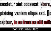
I attached the requested screenshot. The black text on top is the .otf version. I added some arrows to point out the slight shift between the 'a' and the 'b' and the 'e' and the 'p'. The shifts when a comma is involved are quite clear, especially when preceded by the 'r'.
After experimenting some more I believe something is wrong with the kerning in some cases. The 'j' (in both versions) overlaps with preceding characters. I'm not really sure but I also noticed some variations in kerning of the caps.
Hope this is helpful.
 Posting Permissions

 Reply With Quote

Bookmarks