Welcome to TalkGraphics.com
Results 1 to 6 of 6
  1. #1
    Join Date
    Jul 2012
    Location
    Peru
    Posts
    2

    Default Advice on a third complementary font

    OK I'm not a graphic designer, but I am a sculptor and an artistic sort. I'm retired now and I'm working on making a travel blog and I've selected Quincha for my logo and Maven Pro for my blog body. Not sure if it is OK to post a link to a blog mockup so I won't. But here is a rough of my logo: Click image for larger version. 

Name:	JKPeru-tourism-logo-500x226.png 
Views:	225 
Size:	100.7 KB 
ID:	90702

    I'm having a tough time selecting a third font for graphic titles, bars etc. Any suggestions, pointers or advice is appreciated. I can take criticism too. I'm not fragile if you want to say what I've picked so far doesn't work... but I'm liking it. I just need to add balance.

    This is hard! I really have always enjoyed beautiful type combinations (selected by others) and am hoping to learn. So feel free to say why you like what you might suggest.

    Thank you!

  2. #2
    Join Date
    Dec 2007
    Location
    Sunshine Coast BC, Canada. In a beautiful part of BC's temperate rainforest
    Posts
    9,864

    Default Re: Advice on a third complementary font

    Hello kendallq, Welcome to Talkgraphics 
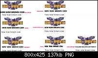
I wasn't too sure about those two fonts till I put them on a page together, I added Overlock Black as a possible third. Overlock is available as a free webfont at either fontsquirrel.com or google fonts.

    Click image for larger version. 

Name:	fonts4kq.png 
Views:	163 
Size:	103.5 KB 
ID:	90703
    [SIGPIC][/SIGPIC]
    My current Xara software: Designer Pro 365 12.6

    Good Morning Sunshine.ca | Good Morning Sunshine Online(a weekly humorous publication created with XDP and exported as a web document) | Angelize Online resource shop | My Video Tutorials | My DropBox |
    Autocorrect: It can be your worst enema.

  3. #3

    Default Re: Advice on a third complementary font

    Hello kendallq,

    Seeing that not having web safe fonts first and foremost on the agenda is an issue, I would use a slab serif for headings and titles. A slab serif might make a nice transition between the blocky lettering of the logo and the slightly quirky nature of the sans serif of your body, Maven Pro.

    The screen shot is of a web page I threw together. Larger text is a slab serif and in this case, SquareSlab711 Bd BT. My current favorite slab serif is Archer.

    Take care, Mike
    Attached Thumbnails Attached Thumbnails Click image for larger version. 

Name:	Home.jpg 
Views:	155 
Size:	103.3 KB 
ID:	90704  

  4. #4
    Join Date
    Jul 2012
    Location
    Peru
    Posts
    2

    Default Re: Advice on a third complementary font

    Wow, what a bunch of friendly people here! Ever since I moved from Brooklyn, NY to high at the top of the Andes in Perú, I've missed this kind of free giving artistic spirit. Thank you both! I'm speechless. I'm going to play around with both suggestions later tonight and reflect back.
    Last edited by kendallq; 05 July 2012 at 04:34 PM. Reason: grammar

  5. #5

    Default Re: Advice on a third complementary font

    Now that is a bit of a shift--from Brooklyn to the Andes!

    You are welcome, of course. btw, each months there is a tutorial posted in the graphics chat area, and we often discuss the techniques and our samples.

    As well, we from time to time are recreating "lost" typefaces and the next one might be a a new design. Check out the posts in the typography forum for the two typefaces we have jointly created--they are free for personal and professional use.

    Take care, Mike

  6. #6
    Join Date
    Oct 2006
    Location
    StPeters, MO USA
    Posts
    10,819

    Default Re: Advice on a third complementary font

    I was trying to bridge the gap between your logo font and body text and it looks like many sanserif suarish bold fonts would work.
    I didn't reach any conclusion as to which one was best though only that I liked them all caps, otherwise it's a matter of taste.
    For now I like Bolster Bold, simply because it is the only suitable squarish font I have.
    OK I kept looking and A Okay and A Okay midnight looks good to me.

    http://www.ufonts.com/fonts/bolsterbold-bold.html


    I kept searching and came up with these.


    free from

    http://www.dafont.com/a-okay.font


    This one is not free

    http://www.myfonts.com/fonts/okaycat/okay-a/midnight/

    Click image for larger version. 

Name:	FONTS.png 
Views:	182 
Size:	136.8 KB 
ID:	90713
    Larry a.k.a wizard509

    Never give up. You will never fail, but you may find a lot of ways that don't work.


Bookmarks

Posting Permissions

  • You may not post new threads
  • You may not post replies
  • You may not post attachments
  • You may not edit your posts
  •