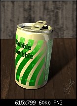
My next attempt. Got carried away changing the background. I hope design on the can is wrapped better.


 Moderator Posthumous
My next attempt. Got carried away changing the background. I hope design on the can is wrapped better.
Larry a.k.a wizard509
Never give up. You will never fail, but you may find a lot of ways that don't work.
 Super Moderator
It's really, really good, Larry, great artwork.
I'm going to have to do a tutorial or seminar or something on use of typefaces, because there is font life beyond the top of the installed fonts list!
Happy Independence Day, America!
-g
 Member
@Stygg: the font I used is called Veracruz and it is the current Free download from SoftMaker They give away a free font each month and the only catch is they aren't licensed for web use so you can't embed them on a website.
@ Gary: I thought your holiday wasn't till Wednesday? Aren't Independence Day and the Fourth of July the same thing? Regardless we are celebrating this weekend too, today is Canaday Day here. So no matter what side of the 49th parallel you are on Have a Safe and Happy Holiday Everyone!
[SIGPIC][/SIGPIC]
My current Xara software: Designer Pro 365 12.6
Good Morning Sunshine.ca | Good Morning Sunshine Online(a weekly humorous publication created with XDP and exported as a web document) | Angelize Online resource shop | My Video Tutorials | My DropBox |
Autocorrect: It can be your worst enema.
Moderator Posthumous
Thank you Gare, you made my day. Guess it was worth the effort.
Larry a.k.a wizard509
Never give up. You will never fail, but you may find a lot of ways that don't work.
Super Moderator
@Larry—
Just put this technique in your pocket and pull it out the next time you're asked to do a product preVisualization.
@Frances— Technically, yes, the Fourth of July here in the States is held on the Fourth of July.
:)
Which is indeed the same US holiday as Independence Day . The Will Smith movie of the same name is fairly representative of how we celebrate.
It's just that our stinking Georgian Calendar put this year's holiday in the middle of the week. So we all decided to lose an entire week's worth of productivity, not wanting to prefer this or the following weekend to drink and accidentally send a bottle rocket into our neighbor's living room window.
@ Stygg—
This is what I mean about scouting down an appropriate typeface. I used ITC Machine, Star Trek Cutline from Bitstream for the headline, and Stop, an older but classic typeface that's usually good for science fiction titling. Stop was designed by Aldo Novarese (1920-1995), whose final typeface before his passing was Nadienne, a very nice script font.
I happened to buy some fresh strawberries yesterday, so the strawberries in the design are a photograph I took a few hours ago, and then traced using Vector Magic. I'm attaching the result as a Xara file so you can add this to a clipart collection, and yes, you can use the Mould tool on the vector fruits.
Don't be afraid to mix media, usa a camera, auto-trace stuff, and for Heaven's sake, use the "wrong font" if need be, but just don't get stuck using the same typeface over and over, only because you're afraid to make a design mistake!
You want to see my portfolio of mistakes sometime? You got some free time for 30 years?
My Best,
Gary
Last edited by Gare; 02 July 2012 at 11:29 AM.
Member
Thanks very much for that Francis
Stygg
Super Moderator
Here's an example of using the Mould tool on text in order to animate it. Now, you'll notice that the animation isn't smooth, not as you'd get when you name a shape with Xara. However, I thought the "stutter" was acceptable, and the reason for it is you can't really animate a Mould shape—it's not in the specifications for Adobe's SWF file format. So every one of the frames is a keyframe with no 'tweening.
I've attached the original Xara file in case you'd like to emulate something like this in the future.
I'm trying on the Xone to converge things, not point out their differences. So a little animation here a little perspective there, if you all feel there's something in it for you when I take this approach.
And by the way, the Continental Congress declared our independence in 1774 (true), but didn't get to drafting the now famous document until two years later.
Happy 4th, USA!
My Best,
Gary
Member
Just got round to doing this, no Arial in sightbut not very good at colour picking, co-ordination and so on, what colour would go with this font and co-ordinate with the next line, if you know what I mean, I'm sure there must be some rule of thumb for font colouring. My font folder as just burst Gary!!
Stygg
Super Moderator
Stygg, selecting colours is an Art, just like drawing, just like typography, just like photography, just like successfully skipping out on the rent.
Fortunately, a friend of mine designs the Ultimate Color Picker. It doesn't go by complementary colors or color contrast. What it does is assemble a palette of colors that are intriguing when mixed with one another. It's hard to explain, but there is some serious code behind the app, and there's a free online version Genopal Online, so twiddle the sliders and then PrintScreen when you have an interesting palette.
I've been using the commercial Desktop program for years, and I can tell everyone that selecting interesting colors is NOT easy. But Genopal makes it easier. I used Genopal to whip up the colors for the Xara Xone website, by the way.
Here are two palettes that I think could be used to design a cereal box:
-g
Super Moderator
Take a look at the attached Xara file, stygg.
It contains a combination of some of the fonts you own, a simple graphic, and an auto-trace of some cornflakes from an image I found on the web. When you see something in your head, you can arrive at the pieces in a number of different ways to put all the stuff together. As far as the layout is concerned, it's pretty standard for a cereal box or even most packaging.
Have fun, and loosen up, man. get inspiration from where you can find it, and have even more fun than you're having right now!
(this is Gary encouraging you).
 Posting Permissions

 Reply With Quote


Bookmarks