I had a bit more time to improve the previous image.
Thanks again, Larry, for the challenge!
James


 Member
I had a bit more time to improve the previous image.
Thanks again, Larry, for the challenge!
James
 Moderator Posthumous
Great one James. I agree with you on that. Plus I have a couple thoughts of my own.Originally Posted by ODdOnLifeItself

invisi ink.swf
Larry a.k.a wizard509
Never give up. You will never fail, but you may find a lot of ways that don't work.
Member
Hello Larry,
Glad that you liked it. Thanks for the challenge.
You also got me thinking about it as a logic puzzle in terms of all the "ramifications" of invisibility.
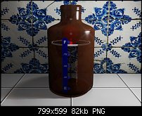
In the image, perhaps I should have made a darker glass, but had made it very clear to see the inside perfectly in the first image. The second image, the inner object will "shine through" anyways, so could make it darker. Which do you think is better, the clear or the tinted?
Good flashfile, Larry! My thought is...invisible ink doesn't make anything invisible but itself.
Take care
James
Moderator Posthumous
James, here is my thoughts on your question.
Of the two I prefer the 1st. I like the brighter colors on the 2nd one and would prefer that one except for the white cotton ball at the bottom. The first one doesn't show that. Also in the second the inner extrusion seems to show which bugs me some. Is it the rounded shape of the inner bottom?
I wonder if it would work to make the bottle dark or even opaque with a clear window to show the ring level, and if there would be enough light to even see the ring under those circumstances.
I do like the feel of being in a kitchen with those objects placed on a tile counter top
These are not criticisms just observations and thoughts. No offense.
Larry a.k.a wizard509
Never give up. You will never fail, but you may find a lot of ways that don't work.
Member
No offense taken, Larry
It's all fun and games!
How do you like this one?
Peace
James
Moderator Posthumous
I like all of them James.
I found this last one kind of dark overall, particularly the background. So I saved your image and brightened it up some. Hope you don't mind.
Larry a.k.a wizard509
Never give up. You will never fail, but you may find a lot of ways that don't work.
Member
Thanks, Larry
The 2nd one, I had brought into Xara and brightened it up, but spaced it for this one.
Much better... good job, Larry
James
 Posting Permissions

 Reply With Quote


Bookmarks