I love watching the development of your maps. I've never been involved in this kind of graphics although when I played Dark Age of Camelot I created my own horse route maps


 Member
I love watching the development of your maps. I've never been involved in this kind of graphics although when I played Dark Age of Camelot I created my own horse route maps
If someone tried to make me dig my own grave I would say No.
They're going to kill me anyway and I'd love to die the way I lived:
Avoiding Manual Labour.
Member
Thank you , BeretGascon! I admit that maps while fun is a very unique part of graphics, so its not as common.
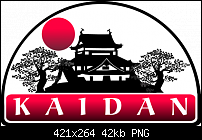
Here's something more common, and not a map. I needed to create a logo for my upcoming adventure setting. I could have done it half a hundred ways, but decided to avoid beveled shapes and keep it simple. I tried it as B/W and if worked, but I preferred to add a touch of red. I think the Japanese castle, cherry blossom trees and moon has a nice touch yet still mostly lineart.
This is a 100 ppi PNG file with background transparency so it can easily be used in any layout. I have a larger 300 ppi version for pubilcation use, but only posted the thumbnail version at 100 ppi.
Thoughts?
GP
Member
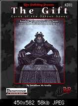
I commissioned artist, Jan Pospisil, to paint the inset image on this cover design. However, I did all other layout for this using Xara Xtreme. Note the subtle detail in the background (if you can even see it at this resolution), but I placed lineart of my main regional map overlaying the black background. All other text placement and necessary logos for publication is part of my page layout for this.
Note, the name on the cover is my author and lead designer, Jonathan McAnulty. However, I get plenty of credit on the title page as concept creator, cartographer, illustrator, art director, designer, developer and technical advisor.
This publication including 14 of my maps will be released sometime Feb/March 2011.
Michael
 Member
I thought the cover design was excellent GP. The background suited the foreground perfectly. The artist you hired did a great job, and your design work finished it off very well.
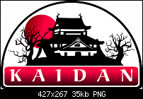
The logo is excellent too. I did have a small suggestion, regarding the sun, and I have attached a Xara file with the details.
Keep up the great work!
Visiting/participating in TalkGraphics since i/us (97).
Member
I appreciate the pointers and comments. Actually the co-publisher, my project designer and various patrons on the project critiquing it, I've changed the design somewhat to accomodate. (I actually prefer the original design even with your suggestions, but its gone a slightly different way - we needed to include a horror element...)Originally Posted by James Allen

More of a sunset/moonset, broke the fung-shwei of tree size, etc.
I will probably yet remove the gradient completely from the moon/sun but its enlarged size has become mandatory to the design... the setting is called Kaidan: a Japanese Ghost Story - it is a Japan-inspired Asian horror Roleplaying Game setting. So horror was needed in the logo.
Last edited by Gamerprinter; 03 February 2011 at 06:08 AM.
Member
I prefer the original Kaidan, but the second has a Scooby Doo look and feel to it,which clearly means it has worked for the theme of the setting
If someone tried to make me dig my own grave I would say No.
They're going to kill me anyway and I'd love to die the way I lived:
Avoiding Manual Labour.
Member
Horror, yes, that changes everything. It's looking good anyway.
Visiting/participating in TalkGraphics since i/us (97).
Member
Regarding the book cover of "The Gift", I hope you won't mind the following observations on your layout. What I like about he existing cover design is the inset image, which is marvellous, and the brooding, spooky atmosphere. What I don't like is that it includes a panoply of competing elements including titles and information in different font styles and logos, none of which follow any kind of geometry. I assume that the size of the book is roughly A4 (in my experience many RP books are this size). So here are some points I would make, in no particular order of importance :
- The black bar under "Rite Publishing Presents" is totally unnecessary and detracts from the book title
- "Rite Publishing Presents" is far too large and is in competition with the title. In fact, is it really necessary at all? They have their logo on the page after all
- The title and subtitle drift inelegantly across the width of the inset image
- The "Kaidan:" text is too close to both the title and the head of the warrior/ghost and competes for our attention. It is complementary information that is important for those whose attention has been attracted by the impact of the book's design, but it shouldn't be part of the main focus of attention
- The background behind the inset is still too light and competes with the main image. In fact I would have been tempted to remove it altogether, but darkening it substantially is the option I have chosen
- The logos at the bottom of the page are far too large, larger in fact than the name of the author!
- The "by" in the author's name is not required
The current layout looks like an attempt to fill the available space with information which, as any good "Before & After" reader knows, is a mistake. Empty space, properly utilised, is good!
I have made a quick (probably clumsy) attempt to rectify some of those points. In the following image I have displayed the rulers, hopefully illustrating my thought processes:
and here is the before and after:
I welcome discussion on how to further improve on the design
If someone tried to make me dig my own grave I would say No.
They're going to kill me anyway and I'd love to die the way I lived:
Avoiding Manual Labour.
Member
I liked the original version, but I appreciate your points beret, and your new version. I think objective constructive opinion of this kind is very useful, and makes for interesting reading. Certainly it creates an environment in which people can learn, try other methods, etc. So, well done.
Visiting/participating in TalkGraphics since i/us (97).
 Posting Permissions

 Reply With Quote
Bookmarks