I like Steve's design as well. Keeping the cards close to the same visual style as the website is a very professional move.
BTW, just wanted to comment... your husband does beautiful work


 Member
I like Steve's design as well. Keeping the cards close to the same visual style as the website is a very professional move.
BTW, just wanted to comment... your husband does beautiful work
Member
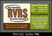
Thank You EVERYONE!
Your comments, suggestions and layouts are greatly appreciated. With all the helpfull info, I have 4 renditions of the card.
Your Votes are appreciated.
http://www.rvrs.ca/images/RVRS_BC.jpg
http://www.rvrs.ca/images/RVRS_BC1.jpg
http://www.rvrs.ca/images/RVRS_BC2.jpg
http://www.rvrs.ca/images/RVRS_BC3.jpg
Thanks again,
Doby
UPDATE:
Not sure why ones without green border at top aren't showing full size - just a newby here so be gentle - lol
UPDATE:
I've added a frame around them so they show full card
Last edited by doby; 21 June 2009 at 10:26 PM.
 Member
Number 2
JOHN -XaReg (FB) XaReg (DB - ignore prompt to register)
Windows 10 [Anniversary] pro Intel Pentium CPU G630 @ 2.70Ghz RAM: 4 GB; 64-bit x64
Member
Here's another idea which echoes your website colours and theme a little more.
The main phone number is more prominent, just as your site - which is important for people to pick out quickly.
Member
Thanks GeminiGuy.Originally Posted by geminiguy

Hubby is pretty good at what he does.
If only his son would learn - lol...
Last edited by doby; 21 June 2009 at 11:17 PM.
Member
Thank you.
Another great design.
Just wondering if it might be a tad busy?
But I must admit, the more I look at it, the more I like it.
(I envision with all those colors it would look good on a shiny card stock)
Definately like your picking up on the large phone number from the web site. This is why it is so great to have experienced & fresh eyes look at your project.
I've incorporated the large number into card No 2 as below
http://www.rvrs.ca/images/RVRS_BC5.jpg
Member
Inspired by Sledger to use all 3 colors, here's another rendition.
http://www.rvrs.ca/images/RVRS_BC7.jpg
Member
Member
At home, we have quite a collection of business cards, some of them are quite clever others quite fancy but when I think about them, not one of them is that memorable because its like living with information overload with written media these days - we are saturated with it.
Repeating colours and easy to read seems to me to be the best!
Here's another version for you to have a look at. I've added a few things and shifted some of it around.
What I have done is take some of the principals from the business cards we have, and modified your one...hope you don't mind!
We found that if you limit the use of fonts and colours on the card, the printer will more than likely gets things right and the cost is kept to a minimum.
Plain card is much easier to write on the back of them....ect., people's names and addresses.
Another thing to think about is making use of the other side...we have done this with our own business cards and this has worked very well for us, as we are advertising two business on the one card with logos either side of the top of the card.
It's difficult to make your card stand out from the rest, so I put something quirky on the back of it! Ofcourse you could leave it plain.
Good luck with it!
From Michele
Member
Thank you Michele for your vision for the card.
I've made another layout inspired by your suggestions.
http://www.rvrs.ca/images/RVRS_BC11a.jpg
http://www.rvrs.ca/images/RVRS_BC11b.jpg
I'ts going to be hard to decide...
 Posting Permissions

 Reply With Quote


Bookmarks