Hey again.
This is a concept logo I came up with, Hope you like the idea.
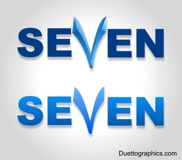
The middle character is actually the digit 7 in Arabic.


 Member
Hey again.
This is a concept logo I came up with, Hope you like the idea.
The middle character is actually the digit 7 in Arabic.
 Member
Very inventive using the Arabic character for seven lordashraf.
 Member
Looks like you're off to a good start, lordashraf. Very clever concept with the Arabic 7/V combination.
One thing you might want to try to do is pull the logo together a bit more somehow. When looking at the logo my eyes and brain interpret it as several different groupings (SE, V, and EN) and it takes a couple of seconds to identify the entire grouping as the word SEVEN. It takes me less time to pull it all together on the second version where the characters are similarly colored. On the first version I tend to read what appears to be a bold 'SE' and 'EN' first then try to find something to do with the Arabic 7/V to make it fit.
Just a suggestion, take it for what it's worth (about 2 cents),
HayTay
Last edited by HayTay; 09 November 2008 at 04:21 PM. Reason: Missed an 'h'
Member
Fiddled around with the Se7en logo a bit and here's what I've come up with so far.
I moved the Arabic 7/V up to give the logotype a strong baseline. The Arabic 7/V was resized so that, while the character still breaks out of the top of the 'word', the lower points on the top of the 7/V now line up with the tops of the 'SE' and 'EN' character groups.
The 'SE' & 'EN' were moved closer together to give the 'word' a more uniform character spacing. A one step contour around the Arabic 7/V was used to 'cut' the two letter 'E's so that they conform to the center character and help reinforce the adjusted line spacing.
And last, I reapplied your linear fill and drop shadow to the entire logotype.
I also exported just a B&W version of the logotype so everyone can see 'just the ice cream without all of the toppings'.
Check it out and see what you think...
Cheers,
HayTay
Member
@ Gray Thank you glad you like it
@ HayTay
Believe me it's worth much more than that, I'm glad u spent the time and effort to play around the logo, I really like what you've done with it, so much.Just a suggestion, take it for what it's worth (about 2 cents)
I just posted the idea, didn't think of polishing it much since it wasn't requested by any body, just popped up my mind. Your "polishing" is really nice though I like it a log, it combines the "digit" with the rest of the "letters" making the word more solid and intact. After reading your comments and looking back at the logo, I find your comments to be very true.
But since I made it, all I see is the Arabic 7/V in the "SeVen" word, which is the idea was drafting in the first place.
Thank you again for your great comments.
Member
lordashraf,Originally Posted by lordashraf

You are very welcome. I thank you for the fun diversion and practice exercise.
I also looked up Se7en and discovered that it is both a movie (1995) and a singer from S. Korea. From what I saw in the three music videos of SE7EN, he appears to be the South Korean version of Michael Jackson.I found it entertaining even though I couldn't understand approximately 97% of what he was singing about.
Keep up the good work,
HayTay
 Member
Okay I have "seen" your new logo and I like the new draft.
Funny dat V is five in roman numerals and seven in arabic.
be aware, not to become a ware.
Member
@HayTay
Very interesting facts
@ankhor and HayTay
Well here are some more interesting facts, as far as I know and learned in school.....
The current Arabic digits were originally Indian digits, I guess Arabs got them while trading with the Indians thousands of years ago. I don't know what Indians use now, though
The current English digits were actually the Arabic digits, I guess they appeared when Arabs invaded Spain and spread their culture there.
And of course the English digits were originally the Roman ones.
 Posting Permissions

 Reply With Quote


Bookmarks