Raymond
Looking good. This has the potential to be one of the most interesting and character full drawings here for a long time.
Persevere.
Derek

 Member
Raymond
Looking good. This has the potential to be one of the most interesting and character full drawings here for a long time.
Persevere.
Derek
"Come in out of the dry and wet yourself by this tap". Spike Milligan
http://www.xaraxone.com/FeaturedArt/mar07/
http://www.xaraxone.com/FeaturedArt/aug10/
http://www.xaraxone.com/FeaturedArt/dc2/index.htm
 Member
Thank you Derek.Originally Posted by masque

The rocks need to be rendered with more detail, the thatch ditto.
The front wall also ... 'tis at total odds with the other.
So .. lots more needs to be done yet ... this is turning into a marathon ...
"Intbel" ... "Can't" is not an option.
Compliance is futile. Resistance is futile. Just do your own thing an' ignore 'em.
 Member
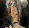
Here is a drawing done by Raymond Breakspear, and I really liked what he had done on the jacket and the pose, but the jacket was far too light, so I asked him if he minded I play around with it. He said "okies". So I worked off of the bitmap image and brought it to stage two. From there I finished it in PhotoPaint. Raymond said I had done enough work on it to take off the watermark. Well consider it a collaborative effort.
2nd star on the left and straight on until moring, eh, Raymond?
In my opinion, it is still his drawing.
Every day's a new day, "draw" on what you've learned.
Sally M. Bode
Member
Very well done, Sally.
Mebbe we should call you 'Wendy' sewing on shadows like that.
(We know the whole thing is a stitch up anyway)
I have lots to learn about lighting and shading and you have been - are being - of great help.
Many thanks.
"Intbel" ... "Can't" is not an option.
Compliance is futile. Resistance is futile. Just do your own thing an' ignore 'em.
 Member
Thanks!Glad you like it!
The first thing jumps in my mind when looking at the picture are the Shadows: It seems to be daytime (looking at the blue sky in the background picture) but the shadows are long - this is impossible. In daytime the shadows are short(er), at down and dusk times the shadows get longer, that's because the sun is closer to the horizon. At midday the sun is above your head, so the shadow's are short and straight from the top. As brighter the sun is - as darker the shadows, for example on a cloudless summer day all shadows are deep dark. On a cloudy day shadows are very soft and less dark.
The color of your Shadows are also black, colorful liquids in a glass drop shadows in similar colors of the liquid itself.
The bowl tells me something is not right in the picture, the light is coming from the left side while it should come really from the top. What material should the bowl be? It could be plastic, it has no highlights or texture. The bowl also looks a bit too small compared to the glasses, but I might be wrong.
The glasses could use some wet drops on the side, like it has just been served, inviting me to sit down and enjoy itLook for reference pictures!
In generel I don't think you have to change much, rather than just making it fit to the background.
It's one of the hardest thing you can do in CGI: add artificial/not existing objects into a real environment! For what you've done so far it's alreay pretty good i'd say, it's "just" the details to make it look real.
 Inactive
Sally - WOW! I like the upper left one. Intbel is looking kinda manly. I like the shadowing. You could add more chest hair though - for more macho thingy
Inactive
Ahhh yes! Much better now the way I see it
Quite a handsome fellow you are in the drawing. I think the macho thing suits you well (the leather jacket sure does)
I've also added some cooler shades to your eyes, and some rings that will suite a man in your status
Do you drive a motorcycle? It will sure suit you even better!
Inactive
Forgot one important thing:
 Member
Open Sesame! its pantomime time
Last edited by parahandy; 15 November 2006 at 11:18 AM.
 Member
Thank you very much for your extended answer Nostaw
And about The Intbel Portrait: Is this you Raymond?? I still thought you looked a bit like your avatar LOL! One little critic on the exellent additions from Availor: can't you make the chest hair a little bit smaller and softer ? Now it looks like the prickles of a porcupine !
Marcia
A mind is like a parachute, it doesn't work unless it's open.
Frank Zappa

 Reply With Quote
 Any suggestions?
Bookmarks