Anthony,
So, if I understand you correctly we should NOT include any reference to XARA in our design submissions. Is that correct?


 Member
Anthony,
So, if I understand you correctly we should NOT include any reference to XARA in our design submissions. Is that correct?

 Member
Okay, antonyf...
Da check is in da mail...
John's images added by Antony:
 Member
Zee, that is correct. However don't worry that your design has it. It certainly won't be decided by that sort of thing. We just need to see a core design that works well, then we can talk with the 'chosen one' afterwards to tailor anything.
I'd start a revolution, if I could get up in the morning.
Member
Hi Anthony,
I removed the Xara advertising references from my design, enhanced it a bit and re-linked my previous post to the new version. Good luck on getting talkgraphics migrated to new message board.
Zee
Banished
Antony,
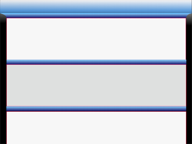
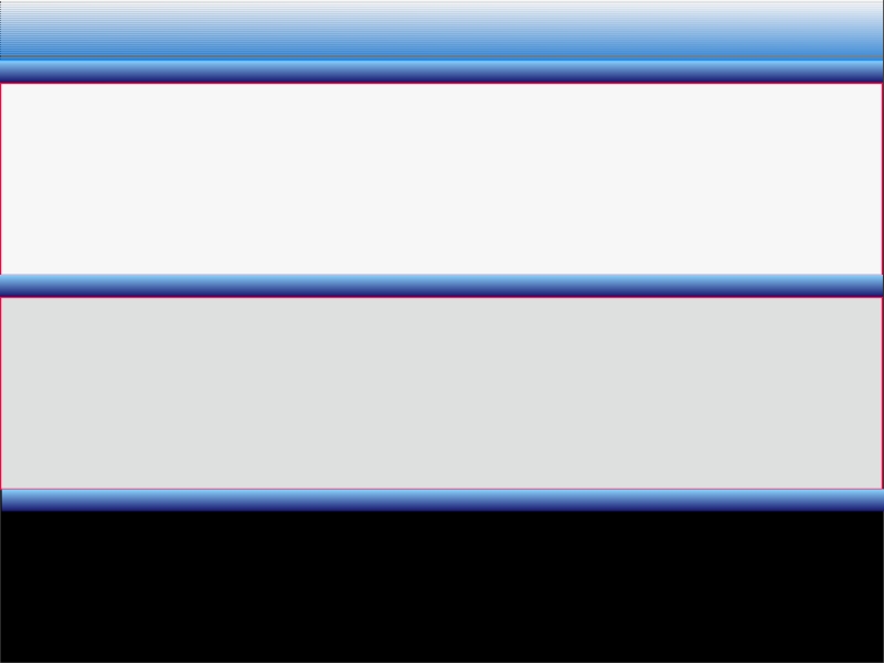
You might want to consider a board with almost neutrals colours, at least on the space where images are displayed (as here on Talkgraphics right now).
Bright colours in general (and especially in the background) of the board will effect/interfer with the colours of posted images.
My 2 cents worth.
Member
Personally... I would rather keep the two shades of grey we alternate with now... It works... and as we used to say in the service...
"If it works... don't F0ck with it..."
Banished
John,
When I was in the service, we always said: "it works... But with a little bit of creative thinking we can make it faster, smarter and more accurate - so we may sleep in longer in the morning..."
What does everyone else think about neutral 'at least' in the post area - where pictures are served up?
Member
"it works... But with a little bit of creative thinking we can make it faster, smarter and more accurate - so we may sleep in longer in the morning..." - Risto
No wonder we had so many more toys to play with... You musta' broke all of yours...
waht is more neutral than gray?
Member
Risto, I agree with muted colors. But I'd prefer to see the gray go as it's so "default". I think more white, or muted shades of a particular color would go well.
I'd start a revolution, if I could get up in the morning.
 Member
I agree also, I think the green and orange theme is kinda dull at this point with the gray and light gray posting panels.
How about considering a muted violet. I use this color for my "3D objects" better known as my windows and menus
My muted violet color: #d1c6d7
A lighter version is:#ece4ef
A green that's easy on the eyes is: #bdcfbc
An orange that' easy on the eyes is: #ffba8a
My design beliefs are, with exceptions, stick to the secondary colors as they are more attractive to most people. Again this is what I've found out there in the hair industry. Most of the nicer looking salons are done in wood (those are your muted oranges or brown) with green and violet accents and plants too!! Black DOES play in to it as it is an industry standard.
So when I was putting my first desktop together, low those many many years ago now, I found that sticking to the secondary colors were easiest on my eyes and still works for me today!!
Then you could create new grays for the posting panels based on either green, orange or the purple hues! Or look in to your neutral, warm and cool grays and see which looks best with the new color scheme, you would be surprised how different those 3 gray tones are!!
That's my input! I'm sure it will look and function just fine when your all done with it Antony!
All the best
Richard
---Wolff On The Prowl---
 Posting Permissions


Bookmarks