Derek... Looks lots better! Take a look at Eggs wookie tut. That might give you a short cut or two for doing the hair.


 Member
Derek... Looks lots better! Take a look at Eggs wookie tut. That might give you a short cut or two for doing the hair.
 Member
Still fine tuning little by little.
Although the background is a photograph the drawing of the figures was produced from pencil sketches rather than photograph(s), which I find impossible to work from, hence the need for this post production editing to get it right, or a least right enough.old folk
"Come in out of the dry and wet yourself by this tap". Spike Milligan
http://www.xaraxone.com/FeaturedArt/mar07/
http://www.xaraxone.com/FeaturedArt/aug10/
http://www.xaraxone.com/FeaturedArt/dc2/index.htm
Banished
Hey! Derek, nice to see some work posted from you again here at TG!
I think it's coming along nicely!
Grafixman said: Why is the old woman winking and smiling? The post office is closing down and I would assume they'd be sad...
I was thinking the same thing? But perhaps the image will be used to illustrate something specific written in the booklet?
Thanks for sharing!
Member
old folk
Risto
Not really the wink was just to make her cheerful, like I said before the post office is shut, no one has died.
(Texture on the face is changed a little as I try to age her a bit more)
"Come in out of the dry and wet yourself by this tap". Spike Milligan
http://www.xaraxone.com/FeaturedArt/mar07/
http://www.xaraxone.com/FeaturedArt/aug10/
http://www.xaraxone.com/FeaturedArt/dc2/index.htm
Banished
Derek,
Ok, got it! Missed that response...
I think the age of the individuals comes across well.
I wonder what it would look like if you lowered the sign a bit - to bring in more of the letters that get cropped? It's seems to be spilling out of the image a little bit? Or perhaps it is the dark line at the top of the sign that makes it look a bit "off" (as if the sign physically ends there?"
Member
old folk
Risto
Sign lowered or rather a border put round to cover the errant patch.
It's becoming an excercise in old skin which is very interesting, trying to arrive at a authentic looking texture and mottling without going over the top.
A few blemishes added.
Derek
"Come in out of the dry and wet yourself by this tap". Spike Milligan
http://www.xaraxone.com/FeaturedArt/mar07/
http://www.xaraxone.com/FeaturedArt/aug10/
http://www.xaraxone.com/FeaturedArt/dc2/index.htm
Member
Hi Derek,
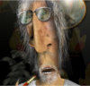
Cheeks look good, forhead looks.... too smooth. Need a laugh line or two at least.
Member
old folk]
Laugh lines on wrinkly forhead emphasised and a lining added to the old chaps jacket as he was looking a little cold.
Derek
"Come in out of the dry and wet yourself by this tap". Spike Milligan
http://www.xaraxone.com/FeaturedArt/mar07/
http://www.xaraxone.com/FeaturedArt/aug10/
http://www.xaraxone.com/FeaturedArt/dc2/index.htm
Member
Looking Lots better Derek. Take a look at her glasses. Are there any hightlights/shadows on the frame? The lenses look good, but the frames look like they need a wittle work.
Member
John
I agree, the frames are more or less just a flat fill at present and need to be re-drawn from scratch which I have started on but it will have to wait a little while I finish a more urgent piece of work, I want to change the colour anyway.
Still that will give me time to notice other stuff that could be changed as well.
Derek
"Come in out of the dry and wet yourself by this tap". Spike Milligan
http://www.xaraxone.com/FeaturedArt/mar07/
http://www.xaraxone.com/FeaturedArt/aug10/
http://www.xaraxone.com/FeaturedArt/dc2/index.htm
 Posting Permissions

 Reply With Quote


Bookmarks