ok, i am making this for a band. REAL simple. what one do you think is better ?
This one ?
Never argue with an idiot. They drag you down to their level and beat you with experience.

 Member
ok, i am making this for a band. REAL simple. what one do you think is better ?
This one ?
Never argue with an idiot. They drag you down to their level and beat you with experience.
Well, I know that i won't...
Member
ok, i am making this for a band. REAL simple. what one do you think is better ?
This one ?
Never argue with an idiot. They drag you down to their level and beat you with experience.
Well, I know that i won't...
Member
Or this ?
Never argue with an idiot. They drag you down to their level and beat you with experience.
Well, I know that i won't...
 Member
I quite like them both - but I'de like them even better if you kept the width down a bit. Like someone mentioned a while ago, keep a check on the width - I just hate having to use the horizontal scroll bar just to read the texts of accompanying messages.
Alan
Alan
Member
I dunno, I like them both, I'll leave the layout decisions to Gary/Ross etc.
However, I don't like the font, it takes too long to process and get what it's saying. You want the reader to be able to easily skim the ad over on a page. You want the design to be catchy so they WILL look at it, but if they don't, you want it to express the point at a moments glance so when they're sitting at home on a Saturday night wondering what to do, they'll remember the name! This is the case for a performance things, but they apply similarly to others
Sooo, change the font to something more legible! Maybe a crystal font (Alram clock, radio, etc.)
Steve Newpor
 Member
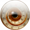
This is the best image you've posted. How much of it did you create? The font is almost impossible to read, but I suppose for a group this might be a distinct advantage (ie the singer formerly known as Prince type logo) With this in mind the second image is better as you can eventually make out the groups name, whereas it's impossible with the substitution of the "A" for the odd shaped graphic. However I like the fill in the top font.
Egg http://www.users.globalnet.co.uk/~eg...union_jack.gif
Egg
Intel i7 - 4790K Quad Core + 16 GB Ram + NVIDIA Geforce GTX 1660 Graphics Card + MSI Optix Mag321 Curv monitor + Samsung 970 EVO Plus 500GB SSD + 232 GB SSD + 250 GB SSD portable drive + ISP = BT + Web Hosting = TSO Host
Member
I made it ALL !
ross Allen
Never argue with an idiot. They drag you down to their level and beat you with experience.
Well, I know that i won't...
Member
Did you create the background or was it an imported bitmap?
Egg
Egg
Intel i7 - 4790K Quad Core + 16 GB Ram + NVIDIA Geforce GTX 1660 Graphics Card + MSI Optix Mag321 Curv monitor + Samsung 970 EVO Plus 500GB SSD + 232 GB SSD + 250 GB SSD portable drive + ISP = BT + Web Hosting = TSO Host
Member
Humble pie if I'm wrong, but do I detect a spot of photoshop's Lens Flare plug-in?
Stu
 Moderator Emeritus
Ross
For someone who alleges to be a programmer, I wonder sometimes if you know how to read?
I have asked, and others have asked, you to keep the width of your images around 600 pixels or less. These two images are 800 pixels wide.
Please, try to be considerate of others and keep the size of your images down to a reasonable size.
Making an image bigger does not make it any better.
Gary
Gary Priester
Moderator Person
<a href="http://home.earthlink.net/~garypriester">
Be it ever so humble...</a>
http://www.thuntek.net/gwp/flag.jpg
Gary W. Priester
Mr. Moderator Emeritus Dude, Sir
gwpriester.com | eyetricks-3d-stereograms.com | eyeTricks on Facebook | eyeTricks on YouTube | eyeTricks on Instagram
 Posting Permissions

 Reply With Quote
Bookmarks