Welcome to TalkGraphics.com
Results 1 to 9 of 9
  1. #1
    Join Date
    Aug 2000
    Location
    Austria
    Posts
    1,081

    Default Pantone colors vs. CMYK-print

    I have a problem with Pantone Colors, hopefully someone can help:

    I have a new client who needs some things printed.
    The main color is "Pantone 382U" according to the Logo I got from the client.
    I have gotten no other information and no old printfiles to consult.

    It is important, that the new stuff matches the existing things by means of color.
    We will not print with spot-colors though, but CMYK.

    Obviously I used Xara's "Pantone 382U" from the color gallery.
    It seems a bit too yellowish, compared to the existing prints though.

    The official CMYK-values from Pantone give a slightly different green, but still not right.
    The official HEX-values from Pantone give an even more different green.

    If I hold the client's businesscard next to my monitor, it matches the third shade (Pantone HEX-colors) most closely.

    My monitor is software-calibrated, maybe not 100% accurate, but close enough.
    Usually stuff looks exactly like expected when printed.

    Do you have any ideas how to make sure I end up with the correct green?
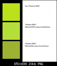
    Click image for larger version. 

Name:	color_problem.png 
Views:	177 
Size:	19.9 KB 
ID:	120485

  2. #2
    Join Date
    Aug 2000
    Location
    Placitas, New Mexico, USA
    Posts
    41,506

    Default Re: Pantone colors vs. CMYK-print

    Boy, this is never easy.

    The printing company may be able to help. Only about 1/2 of Pantone Spot colors can be matched exactly in CMYK. 25% of the remaining colors can be close, and the last 25% cannot be matched.

    A bright green on the screen will not print that bright.

    Does your client have a CMYK printed sample? It might be easier to match with a CMYK swatch book that way.

  3. #3

    Default Re: Pantone colors vs. CMYK-print

    Pantone's cmyk values (or any of the value types) from the web site—or any web site's values for spot colors—are what I call "dumb" values. That is, they exist without meaning or context. This applies to the swatch books to some extent with te exception the swatch books are printed using the output profile that they specify in the books. But the cmyk values listed are only good for that particular profile.

    Pantone's cmyk values vary depending upon the pdf's output profile. That is, they change depending upon the pdf output profile as they ought to. The only means to be reasonably accurate is to take the output condition into account.

    The old, clunky and funky software they sell (it's terrible software, and that according to their tech support) can and does give accurate color model values. I have it and have used it for years even though it is a right pita.

    Xara products will do the conversion properly if a output profile is used. Which means that you need to know what the print establishment is going to use by way of output profile.

    Talk with the print establishment about leaving spot colors in the pdf. It is possible for some "real" print establishments to do the conversion at print time, which means exporting to a pdf profile that retains spot colors as spot colors. Most of the print establishments I use prefer to do the conversion as they have tweaked the Pantone look up tables to suit their presses. Online printers don't want spot color as spot color.

    Xara applications are not color managed. You cannot trust what they show you on-screen. The only pdf viewing applications that are color managed are Adobe Reader, Acrobat and pdfToolbox.

    Mike

  4. #4
    Join Date
    Aug 2000
    Location
    Austria
    Posts
    1,081

    Default Re: Pantone colors vs. CMYK-print

    Nowadays, everybody is using online printers, so spot colors are pretty much off the table.
    There are two main competitors, both require ISO Coated v2 300% (ECI) as profile.
    I have set up complete profiles for them in Acrobat and like I said, usually the prints look just like they should.

    I have a printed business card of the client.
    The green on it is 99% identical to the 382U of the Pantone swatch book.
    Difference might be because of the paper used or the age of my swatchbook.

    Both of them look like my third, most greenish/least yellowish, sample above though.

    I guess we will just have to print this batch and hope for the best.

  5. #5

    Default Re: Pantone colors vs. CMYK-print

    I have used online printers that use Pantone colors.

    Be that as it may, if you know the Pantone number and the output profile, use them and set the Xara application to embed the profile. And export to cmyk so the Pantone is a forced conversion.

    The conversion will be accurate, but if they used a different profile to create their print pdf, there may be a difference. The only other thing you could do is use the exact cmyk breakdown if you knew it. Even then if the press is different that too would likely result in a shift.

  6. #6

    Default Re: Pantone colors vs. CMYK-print

    Using that profile, below are the cmyk numbers that make up Pantone 382 U according to Pantone's PCM software.

    Click image for larger version. 

Name:	capture-001803.png 
Views:	118 
Size:	25.7 KB 
ID:	120493

    And I take back what I wrote above. XDP cannot force the conversion. In the screen shot below, the upper rectangle is the cmyk values and the lower one is that spot as a spot color.

    Click image for larger version. 

Name:	capture-001804.png 
Views:	189 
Size:	4.3 KB 
ID:	120494

  7. #7
    Join Date
    Aug 2000
    Location
    Austria
    Posts
    1,081

    Default Re: Pantone colors vs. CMYK-print

    Quote Originally Posted by mwenz View Post
    And I take back what I wrote above. XDP cannot force the conversion. In the screen shot below, the upper rectangle is the cmyk values and the lower one is that spot as a spot color.

    Click image for larger version. 

Name:	capture-001804.png 
Views:	189 
Size:	4.3 KB 
ID:	120494
    By "upper rectangle", do you mean the back one, because it is higher up on the y-axis, or the one above the other on the z-axis?

    The one in the back matches the business card very closely.
    Thank you.

  8. #8
    Join Date
    Aug 2000
    Location
    Austria
    Posts
    1,081

    Default Re: Pantone colors vs. CMYK-print

    Sorry I made a mistake, slightly new situation:

    When I wrote

    Obviously I used Xara's "Pantone 382U" from the color gallery
    I seem to have remembered that wrongly.
    When I opened the logo (.eps) in Xara, two *named* colors were imported. NOT spot colors.
    Those colors were named "Pantone 382U" and "Pantone 419U" and they came from the official logo. So I must have taken for granted that those were the right colors.

    After Mike's last post, I checked his color samples against mine.
    In Xara, in Acrobat and in Photoshop. And none of the two were anywhere near anyone of mine.

    So I went back to start and picked the actual *spot* colors, this time really from Xara's gallery.

    Exported the whole thing again, and look at that, new problem. Possibly.

    The color seems right by hue now.
    But what was too much saturation in the first export is too little now.

    Now I am really unsure what to do.
    Heads ups anybody?

    Click image for larger version. 

Name:	color_problem2.png 
Views:	349 
Size:	42.3 KB 
ID:	120495

    Click image for larger version. 

Name:	color_problem3.png 
Views:	114 
Size:	15.5 KB 
ID:	120496

  9. #9

    Default Re: Pantone colors vs. CMYK-print

    The one higher on the page is the upper one, which is at the back of the stack. It is the one using the cmyk values that I posted.

    Please consider uploading the logo and sending me a download link via private message.


Bookmarks

Posting Permissions

  • You may not post new threads
  • You may not post replies
  • You may not post attachments
  • You may not edit your posts
  •