I didn't align anything to a pixel grid. The lines are 1, 2, 3 pixels in width. I did use a photo type of document and made sure the rectangle is whole pixels, though. But I just plopped the text and the lines down on it.


 Member
I didn't align anything to a pixel grid. The lines are 1, 2, 3 pixels in width. I did use a photo type of document and made sure the rectangle is whole pixels, though. But I just plopped the text and the lines down on it.
 Member
Hopefully this will help you understand the issue
Egg
Intel i7 - 4790K Quad Core + 16 GB Ram + NVIDIA Geforce GTX 1660 Graphics Card + MSI Optix Mag321 Curv monitor + Samsung 970 EVO Plus 500GB SSD + 232 GB SSD + 250 GB SSD portable drive + ISP = BT + Web Hosting = TSO Host
Member
Thanks for that video. Indeed, the pink lines clearly demonstrate the antialiasing effects of alignment.
But I'm afraid I still haven't made my point clear. I'm not at all worried about the antialiasing of individual letters ... like the "e" in your example.
What I'm trying to achieve is the same antialiasing when the same exact text is exported from different locations on a graphic. ... so that the "e" is antialiased the same, for example.
If the words This Is A Test are in two different locations on a graphic, the text will look a tiny bit different in two different exports, unless the text is aligned on the exact same pixel basis. I've used 'whole pixel' as my origin for simplicity's sake. But the same effect would happen if I used 0.4, for example. As long as the strings are org'd the same, they will export the same.
Member
The only way you could achieve this is converting the text to Editable Shapes, Ungrouping twice, then move every character to whole pixel origins. Why you'd want to do this though I've no idea
Egg
Intel i7 - 4790K Quad Core + 16 GB Ram + NVIDIA Geforce GTX 1660 Graphics Card + MSI Optix Mag321 Curv monitor + Samsung 970 EVO Plus 500GB SSD + 232 GB SSD + 250 GB SSD portable drive + ISP = BT + Web Hosting = TSO Host
Member
That's the point I don't seem to be able to get across. I don't care if individual characters are on whole pixel origins. I only care that the same text stringor the same graphiclooks the same when it's exported from different occurrences on a page. They do if I take the time to origin them to whole x,y points on the page.then move every character to whole pixel origins
I'll mention that I got onto this subject because I exported a vertical column of buttons that had a very thin shadow defined on their right side. The resulting PNG showed a heavier or lighter shadow down the column ... due to the same effect as your pink lines demonstrated. When I left-aligned all the buttons to the same X position, the effect went away. Closer inspection showed that text was subject to the same effect.
 Super Moderator
I avoid buttons that force a graphical output. Instead, I use CSS and text to very good effect, retaining crispness at scale.Originally Posted by Contours

You initially mentioned exporting text boxes and this has morphed into vertical buttons.
If it is a text box, export the PNG at a higher dpi setting.
If it is a button, aim for a button that does not convert the text to a graphic.
Acorn
Acorn - installed Xara software: Cloud+/Pro+ and most others back through time (to CC's Artworks). Contact for technical remediation/consultancy for your web designs.
When we provide assistance, your responses are valuable as they benefit the community. TG Nuggets you might like. Report faults: Xara Cloud+/Pro+/Magix Legacy; Xara KB & Chat
Member
Morphed is an understatement. The heavy/light effect has a single common denominator (Xara's export antialiasing calculations), but the discussion has taken about 5 directions.You initially mentioned exporting text boxes and this has morphed into vertical buttons.
Is there a way to control the antialiasting effects on exports? The answer is "yes" ... but you have to manage the x,y origins, yourself.
Hopefully, this thread will help others be aware of these effects (Egg's video will, anyway). But, for now, I have what I need. If I have other questions, I'll post them with clear examples.
Thanks for the responses.
Member
+
As a footnote to this discussion: I found a way to force Xara to operate on whole pixel boundaries.
It requires using the Grid and Ruler spacing (in Page Options). You declare a Major spacing of 1px, with the number of subdivisions set to 1.
You then set the Window option to Snap to Grid. With these settings, you can move an element (graphic or text) leftward and upward to land only on pixel boundaries. In the other directions, the pixel point depends on the width of the element. It always aligns "the leading edge" on a whole pixel.
I was pleased to find that you can have Snap to Grid and Snap to Objects activated at the same time.
In addition to the PNG exports I described above, I'll use this method to fine tune elements before exporting a website. Up to now, I've had to make manual adjustments.
Member
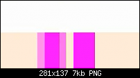
I can't replicate this Contour. Take the text line 'llrslfll', you're stating the letter 'l' will be rendered the same at all times. However if you look at the attached image you can clearly see the character 'l' between the 's' & 'f' are rendered differently than the other 'l''s.
Egg
Intel i7 - 4790K Quad Core + 16 GB Ram + NVIDIA Geforce GTX 1660 Graphics Card + MSI Optix Mag321 Curv monitor + Samsung 970 EVO Plus 500GB SSD + 232 GB SSD + 250 GB SSD portable drive + ISP = BT + Web Hosting = TSO Host
Member
Actually, no. That's not what I'm saying. I'm saying that two occurrences of the same text string on a graphic will export the same if the x,y coordinates for both are on whole pixel boundaries (and, actually, on the same "boundary basis" ... x=0.6 and x=0.6, for example).you're stating the letter 'l' will be rendered the same at all times
Just duplicate your test string and move it to another location on your graphic. Then export each of them, independently. The results will only be the same if you have pixel-aligned them. Otherwise, they will show the same kind of difference among letters that your example shows. IOW, the first "l" in the first export will look different from the first "l" in the second export.
The antialiasing calculations are the root cause. And magnifying the effect by using thin text is only an easy way to see it. But the more "delicate" the graphic, the more noticeable the effect is.
 Posting Permissions

 Reply With Quote

Bookmarks