Welcome to TalkGraphics.com
Results 1 to 8 of 8
  1. #1
    Join Date
    Dec 2014
    Location
    San Diego
    Posts
    362

    Default Class Assignment: Concert Poster

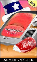
    For my Concept Design, class, our first assignment is to create a poster advertising a concert for a band of your choosing (I chose internet artist/dj Macross 82-99) happening on the 4th of July at 8pm in San Diego Harbor. Techniques to develop the concept discussed in class were used (and reviewed before getting to the thumbnail and then comp stage) from which 12 completely different concepts were developed then one was chosen, 6 different layouts were sketched and then one was chosen then finally, I started working on the poster.

    Keep in mind, it's not finished yet (it's missing some details and minor elements like an American Flag bowtie for the bottom left corner of the image).

    The concept for this was satirizing Americana and consumerism, themes with the band/artist. The artist themselves has a strong 'feel' of sci-fi anime, so I set the whole thing in a post apocalyptic desert of a future ruled by giant robots (you can see one reflected in the soda can). As well, the music itself has a very 'classic 80s' feel, so for the entire look, I wanted an 'airbrushed album cover' type look.

    So this is everything 'academic' behind it. And now the almost done (about 75% done in my estimation) poster. I'll update tomorrow when I finish it up (it's due monday).

    Any critiques or problem areas (especially the information...I'm hoping that it works since the only text that's in english is the concert information and am hoping this is enough to convey everything...I put the information about the 4th in the 'exploding corner' in order for audience to instantly see it and get a 'feel' that this is something related somehow before the rest of the poster is viewed from top to bottom)


    Click image for larger version. 

Name:	poster-wip.jpg 
Views:	237 
Size:	76.8 KB 
ID:	107262

  2. #2
    Join Date
    Sep 2000
    Location
    Bracknell, UK
    Posts
    8,659

    Default Re: Class Assignment: Concert Poster

    I can't decide if the information is just not prominent enough and just too subtle for the casual glance to take in - the three important facts spread over three places.

    The 'harbor' text needs some anti-clockwise rotation. I think the perspective of the channel knob is slightly off.

    I don't read the poster top to bottom. The lips are really dominant, so Macross is what I read first, then Harbor and I have to look around for the 4th.

    I didn't think 'airbrush'.

  3. #3
    Join Date
    Dec 2014
    Location
    San Diego
    Posts
    362

    Default Re: Class Assignment: Concert Poster

    Quote Originally Posted by pauland View Post
    I can't decide if the information is just not prominent enough and just too subtle for the casual glance to take in - the three important facts spread over three places.

    The 'harbor' text needs some anti-clockwise rotation. I think the perspective of the channel knob is slightly off.

    I don't read the poster top to bottom. The lips are really dominant, so Macross is what I read first, then Harbor and I have to look around for the 4th.

    I didn't think 'airbrush'.
    I can play with some values to draw the eye up to the top left more. I think once I get done shading the hat, it will stop being this huge eye attraction. It currently is occupying the brightest portion of the image and it has 0 bits of information.

    I've been having TONS of trouble getting the perspective to 'feel' right on the TV overall. It's one of those instances where I wish there were better perspective drawing tools in Xara (made a request before). What I ended up doing was using the built in 3d on a 'flat front view' of the TV, then rotated them all at once, but it moved things separately, but if i grouped it, then it wouldn't have depth, so i went with the first one, and then repositioned all the pieces around, but I had to manually adjust them due to the lens effect being eequally applied to all items as if they each occupy the entirety a camera that only is showing them.

    Very frustrating.

    Same thing with the text across the screen. The TV has a 'natural curve' to the front of the CRT (well, they do in that style, they're convex), but it's difficult to figure out the best way to go about warping the text to the shape, and then I want to actually make it look like it's a CRT with analog effects, but don't even know where to start with that and then to have it wrap to the surface...omg...I'm kinda just not doing it so I can turn this in, but it's something I definitely want to add after I get graded just to know how to do it.

    The airbrush effect isn't necessarily meant to say that it looks like it was made with an airbrush, it's supposed to evoke the feeling of old airbrushed covers like this one:

    http://38.media.tumblr.com/tumblr_la3c1ymHRH1qdwp72.jpg

    Where it's somewhat realistic, but there's things that are 'too perfect' or 'off' about it. For instance, the TV actually contains elements from later models and earlier models at the same time.


    Anyway, I'll post back when I adjust the values a bit to 'force' a bit of movement from word to word.

  4. #4
    Join Date
    Dec 2014
    Location
    San Diego
    Posts
    362

    Default Re: Class Assignment: Concert Poster

    Actually thinking about it, the july forth blurb would be better served on bottom left or as a logo satire on another object near by...thanks for bringing that up, i got an idea.

  5. #5
    Join Date
    Sep 2000
    Location
    Bracknell, UK
    Posts
    8,659

    Default Re: Class Assignment: Concert Poster

    On the perspective front - perfection is not required and indeed in some ways adds to the poster. The harbor text alignment jars with me though.

  6. #6
    Join Date
    Aug 2000
    Location
    Placitas, New Mexico, USA
    Posts
    41,512

    Default Re: Class Assignment: Concert Poster

    I like it a lot. I have no idea what the concert is and I cannot read Kanji. But it is intriguing and draws the viewer and engages her or him.

  7. #7
    Join Date
    Apr 2005
    Location
    Vancouver Island, British Columbia
    Posts
    4,194

    Default Re: Class Assignment: Concert Poster

    Looks like a fun assignment, hseiken. Looking forward to the finished product.

  8. #8
    Join Date
    Dec 2014
    Location
    San Diego
    Posts
    362

    Default Re: Class Assignment: Concert Poster

    Here's the final poster, based on suggestions and some rethinking about how the structure of the image should work. I also addressed some of the perspective issues, though I still couldn't find the 'right' feel for what angle to put the text, so i focused more on making it 'feel right' between the anchors of the image, the coke can and the blue bar of the hat.

    Anyway, hope you dig, I don't have any time to change it before class tomorrow! Click image for larger version. 

Name:	macross8299posterfinal.jpg 
Views:	143 
Size:	86.7 KB 
ID:	107281


Bookmarks

Posting Permissions

  • You may not post new threads
  • You may not post replies
  • You may not post attachments
  • You may not edit your posts
  •