discs


 Member
discs
Member
discs
Member
Even addicting which some of my vices aren't. Maybe I should make this my desktop background image just to remind me to give it up every once in a while. [img]/infopop/emoticons/icon_wink.gif[/img] Great work!
I reboot Windows for a living
"If you can do good, you should."
W.K. Clark
 Moderator Emeritus
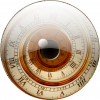
Very nice interpretation of the glass disc.
If you are new to the forum, welcome. Good to have a representative from Portugal with us :-)
Gary
Gary Priester
Moderator Person
Be It Either So Humble...
Gary W. Priester
Mr. Moderator Emeritus Dude, Sir
gwpriester.com | eyetricks-3d-stereograms.com | eyeTricks on Facebook | eyeTricks on YouTube | eyeTricks on Instagram
Member
I really like your image, it is really inspiring and I like the gel filled effect of the text.
Just one point however, the glass disc seems to be two plates joined by the walls of the central hole. There is nothing joining the outside edge. Is this intentional?
Whatever, this image is brilliant!
Michael Ward
<img="http://www.cashflowstore.com/temp/sig.gif">
Member
Yes it is really coool disk but i agree with Michael comment, it looks as if they are seperate disks. [img]/infopop/emoticons/icon_rolleyes.gif[/img]
The effect for the text is new way of applying the gel .
 mod
Member
mod
Member
I have not been following the disk thread but that is a great image you have made.
Bruce
----------------------------------------------------------
Happiness is free for the taking, Please take some for yourself
Artist For Hire
Member
Thanks for the comments. I'm not new to the forum
actually I was active trying to to take the most of EPS output of Xara and posted severall comments before finishing with my latest conclusions some months ago. But this mather seemed not very important to Xara users.For me it is because I use Xara to do all my advertising work. Just look for my posts. In fact I cannot conceive my life without Xara!
Considering the sides the they are there but conversion to bitmap "erased" a little the effect.
I did this during lunch time so today If I have the time I will improve it and post it again.
from Lisbon with wishes of the best for all
emel
Member
The text on the refelction seems to be in the wrong place.
It looks as if the the top of the "Xara" word is being reflected, yet the words "can become a vice" are there, even though they are positioned at the bottom of the word. In fact it should be "the general surgeon warns you" and should be aligned to the left hand side instead of the right.
Just a minor little thing, but can be significant to give your piece that little extra professional feel.
Michael Ward
<img="http://www.cashflowstore.com/temp/sig.gif">
 Posting Permissions

 Reply With Quote
Bookmarks